Magic Times
26 Friday Jun 2015
Posted in Fantasy art, Illustration.
26 Friday Jun 2015
Posted in Fantasy art, Illustration.
14 Sunday Jun 2015
Posted in golden ratio
Tags
A Gathering of Dwarfs, Ben Hammott, book cover, Dwarf, Fantasy, Fantasy Art, Fantasy illustration, golden ratio, Keith Draws, typography
Here is the solution and below is a description of how I came to it:

A Gathering Of Dwarfs cover art © Keith Draws
When I read Ben Hammott’s “Dead Dragon’s Gold Book 1, A Gathering of Dwarfs” I realized I was going to have to take a slightly different approach. The Book begins where the tale of Snow White and the Seven Dwarfs left off. The Dwarfs have separated to find their way in the world but other forces are at work to bring them back together; to take on an epic quest.
In this Book we get a deep insight into their individual character and the powers at their disposal, as well as some hints of the powers that have begun to pull their strings; and this was what I decided to show by taking a similar approach to that of the great ‘Drew Struzan’ when he produces movie posters – such as those he created for Blade runner and Star Wars.
I decided to paint a scene from each of the Dwarf’s stories and tie them all together using images representing the forces that manipulate them in the story (sorry this sounds vague but I don’t want to give spoilers). If you want to know more the book is right here.
For the composition I opted for sacred geometry. Each illustration was designed using Golden Ratio’s and the final composition was laid out using the same method, which though it looks complex actually simplified things for me since I had very specific areas where I could place the images and, because they were designed using sacred geometry, balance was much easier to achieve, and when positioning the images all I really had to consider was the color balance (The object being to draw the eye into the focus and then lead it on into the details,) since the positions and sizes were dictated by the grid.
Here is the image with some of the geometry laid over it (I’ve simplified it somewhat to make it clearer, but hopefully you’ll get the idea).
I feel it turned out well and Ben is very happy so overall it was a good result.
15 Friday May 2015
Posted in Uncategorized
Tags
book cover, Cover Art, Cover design, illustration, Keith Draws, Photo compositiing, Special Offer, typography
To say thanks for all your support I’ve created these Summer specials:
Check it these great deals: https://goo.gl/2zpxwS before all the slots are booked.
I’ve also added character design for only $45 a character, front action view, back and side all in full color.
18 Saturday Apr 2015
Posted in Uncategorized
Tags
composition, Cover Art, Keith Draws, layout, RPG., typography
That’s because I’ve been incredibly busy with extra work. As well as producing cover art (much of which you can see in my updated gallery), I was asked if I could help Ed of Shades of Vengeance (an independent RPG company) who, for reasons beyond his control, found himself without a graphic designer to produce the Rule Books he has promised. So I stepped up to design and produce them for him. First off I made Era: the Consortium, A 300 page rule book for an incredible game featuring an incredible and engaging history which works just as well as an excellent stand alone scifi story. I wanted to do it justice and so we put some considerable thought into the final look (as you guys know I don’t do things with half measures) and so started from scratch. The funded kickstarter is here and Details of the game are here. It’s all done now and here are a few spreads so you can get a feel for it.
I’m also going to be designing and producing the rule book for “Era: Lyres” and you can learn all about it and back it with the kickstarter right here In the meantime here is the cover I finished recently. More to come soon.
04 Friday Apr 2014
Posted in Book cover, color, Composition, Fantasy art, golden ratio, Illustration., Science Fiction, Typograpghy
Tags
book cover, composition, Cover Art, Cover design, Fantasy Art, golden ratio, Keith Draws, layout, Richard Tongue, Sci Fi, science Fiction, typography
When Richard approached me to do the cover for the latest book in his highly successful Science Fiction series, I have to say I was a little intimidated.

Sacred Honor cover art ©Keith Draws
The covers I’ve done for this series prior to this one I consider to be some of my best work.
How was I going to top what I’d already achieved?
I needn’t have worried though. As soon as I read the brief my mind was filled with ideas. and this is the amazing thing about working with Richard.
He has such a powerful vision., and it would bring out the best in any artist.
” The specification for Sacred Honor is a wind-swept plain, with a pair of officers looking up at a ruined, obviously alien statue – one of them Marshall, the other the woman from the cover of Price of Admiralty. (That goes back a bit!) They’re wearing uniform trousers and warmer brown jackets, pistols holstered at their belt. There is a red sun in the sky, casting a faint light. As for the statue – I haven’t got any fixed ideas on it, but I’d like it to evoke that old ‘Ozymandius – King of Kings’ quote. It is old, very old, and crumbling away; some pieces of it are on the ground, there’s a strange mould growing across some of it, pieces missing, that sort of thing.”
I immediately looked up the poem:
Shelley’s Ozymandias
“I met a traveller from an antique land
Who said: Two vast and trunkless legs of stone
Stand in the desert. Near them, on the sand,
Half sunk, a shattered visage lies, whose frown,
And wrinkled lip, and sneer of cold command,
Tell that its sculptor well those passions read
Which yet survive, stamped on these lifeless things,
The hand that mocked them and the heart that fed:
And on the pedestal these words appear:
“My name is Ozymandias, king of kings:
Look on my works, ye Mighty, and despair!”
Nothing beside remains. Round the decay
Of that colossal wreck, boundless and bare
The lone and level sands stretch far away.“
And as I opened manga studio 5 I began to think about lost and extinct alien civilizations.
First came the windswept plain and the alien sky. Distant alien mountains. Next, I began to sketch the ancient alien statue. I thought of the Egyptians, I thought of the of the great Frazetta as he painted the work of Edgar Rice Boroughs, and I began to feel a great sense of loss for the civilization that was now expired. This emotion found it’s way into the statue I was drawing who I realized was now screaming in despair.
Finally, I placed the witnesses to this tragedy, the brave explorers of Richard’s space opera. I landed their ship and sent them exploring the strange and ancient world.
Once the visual was completed I forwarded it to Richard. It looked like this: 
Well, fortunately, Richard liked it and so I went on to complete the work. As you can probably see I made a few minor changes but I think it came out well.
To be honest this kind of work is why I got interested in painting in the first place and I hope it inspires the sense of mystery and the intense desire to know more about the story that it does for me.
You can keep up to date with Richards work here: .http://richardtongue.blogspot.co.uk/
29 Saturday Mar 2014
Posted in Book cover, Composition, Fantasy art, golden ratio, Illustration., Science Fiction
Tags
book cover, Cover Art, Cover design, golden ratio, illustration, Keith Draws, Richard Tongue, Sci Fi, science Fiction, typography
The setting is a seedy bar on a Space station.

Triple Cross cover art ©Keith Draws
Richard asked for a “film noir” type feel to the image.
The protagonist was to be seen drawing his gun while keeping hold of his drink, meanwhile, behind him, a glamorous singer/dancer is observed by the bar crowd.
In order to get the feel I went for deep contrast in the lighting, but everything looking a little subdued by a mass of cigarette smoke (just like in the old movies).
I also realized that on a space station (that is spun to achieve gravity) it would likely be a low gravity environment. So everything had to have that slow-motion feel.
The dancer would be taking advantage of her low weight and able to make extraordinary moves while singing.
The protagonist drawing his gun knocks over the table and chair and the drinks almost float into the air.
Through the space station window, If you look carefully you can see a nod to the “Battlecruiser Alamo” Series.
To keep up to date with Richard’s books you can follow his blog here: richardtongue.blogspot.co.uk/
26 Wednesday Feb 2014
Posted in Book cover, Fantasy art, golden ratio, Illustration., Typograpghy
Tags
book cover, composition, Cover Art, Cover design, design, golden ratio, illustration, John DeJordy, Keith Draws, Library, Transitions, typography
John gave me the following Brief:

Transitions cover art ©Keith Draws
“The setting is an elegant library with carved rosewood–as if the Sistine Chapel and a library crossed.
The focus, though, is on a painting hanging on the wall.
It is of a woman, wearing a beautiful, full-length gown as if going to a ball, and she is holding a deep-red rose. She has long, black hair and green eyes.
The portrait should have Diane sitting down, looking toward the spine of the book. Behind her, in the painting, a forest green (or some green that looks nice) tapestry with a unicorn (just enough to recognize it as such, if possible.
Diane has a slender nose and hypnotic eyes, and a wonderful smile. The smile is important. It doesn’t have to show teeth, just obviously a smile. She should be wearing a corset. The library, which I assume would be mostly on the back, would be of books and scrolls.”
To create the library I started with the amazing free “3D Mandelbulb Ray Tracer”.
It’s an amazing tool and it lets you create extraordinary images with a little patience.
I made multiple renders and edited them together to create the basic structure and then went on to add lots of details.
Inspiration can come from many places.
Johns Blog can be found here: http://johndejordy.com/
and his facebook: https://www.facebook.com/john.dejordy
24 Monday Feb 2014
Posted in Book cover, color, Composition, Fantasy art, golden ratio, Illustration., Typography
Tags
book cover, composition, Cover Art, Cover design, design, Fantasy Art, golden ratio, illustration, Keith Draws, kindle, Kobo, layout, Photoshop, The Rule of Thirds, typography
I’ve been working with Richard for quite some time and he usually gives me quite a free hand with what I do, but not this time.
Getting a brief like this can be quite intimidating:

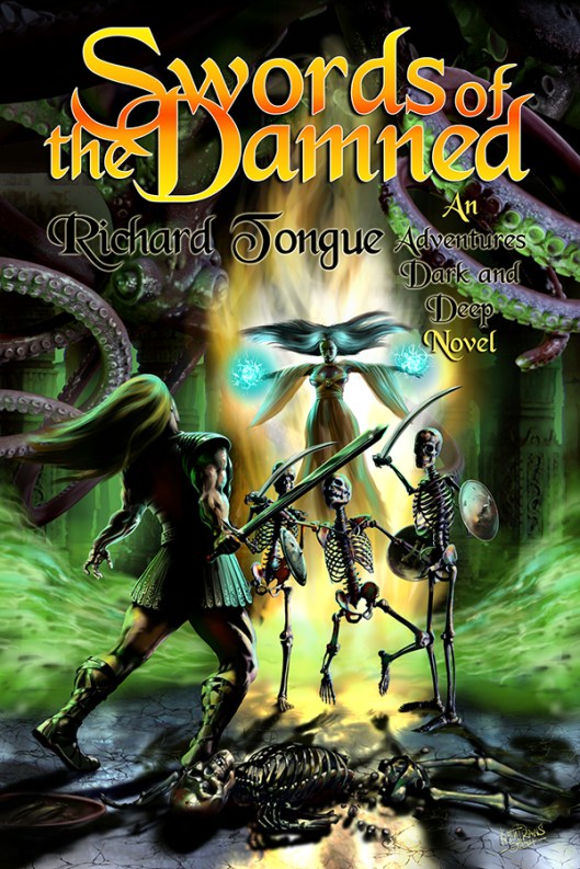
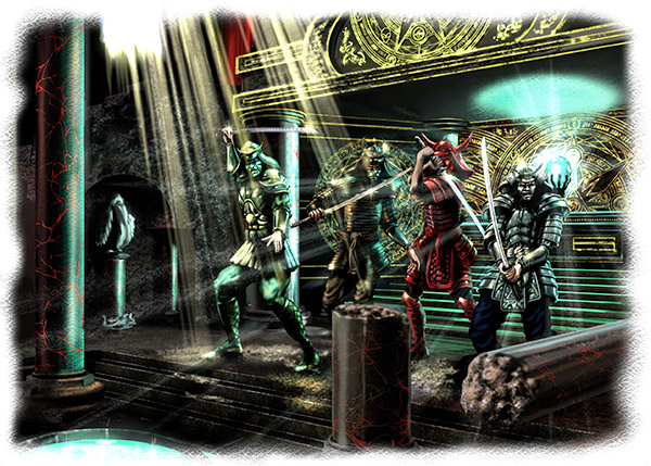
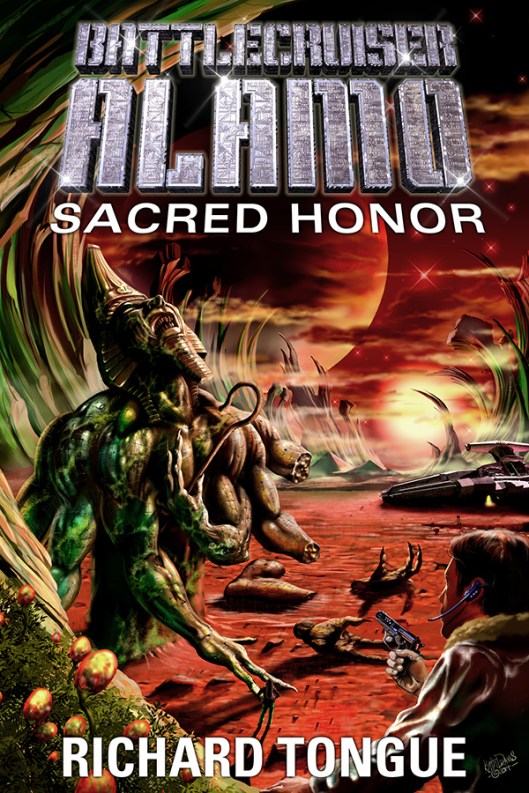
Swords of the Damned cover art © Keith Draws
“The setting is a dank and dismal dungeon, illuminated by strange luminescent mold on the walls, not bright but bright enough to illuminate our heroes – the dungeon itself is an ancient tomb, strange symbols and markings carved into the cracking marble. Two heroes are engaged in battle,one of them a rougish-type fighter wearing leather armour, carrying a sword, the other a raven-haired sorceress wearing a long, flowing robe – the colour of which I leave to you, whatever you think looks best, preferably with some strange and arcane symbols on it, and her hand is raised, crackling with eldritch blue light. They are fighting some nasty skeletons – think the Harryhousen type from ‘Jason and the Argonauts’ – armed with shields and swords. There are some ‘dead’ skeletons on the ground, and some sort of horrible creature up above about to catch them by surprise.”
There is a lot going on and a lot of characters appearing in the image so how to go about bringing it to life in a way that will sell the book?
Well, the image needs to draw the viewer into the scene so a view into the temple with perceptive to draw the viewer in and lighting to create a focal point seemed like a good start.
First off I laid in a Golden Ratio 9 section Grid as a template which I would use to help balance the image.
Next, the background/temple was laid in making sure there would be enough air for the title and Author in the top “third” of the grid.
Now onto the characters. I decided to place these in layers from back to front in order to help enhance the depth. I sketched in the rough positions.
Starting with the giant octopus creature in the background, making it dark and almost unseen.
Next came Sorceress, I placed her to the right of the center section of the grid she’s kind of hovering in a dramatic almost Christlike pose, bathed in light, casting a spell. I placed a bright surge of magic power behind her that is reflected in the floor and this serves almost like vertical arrow drawing the eye up from the base right to her.
Next, I painted the green smoke surging off to the sides which also serve to lead the eye in but this time from the sides.
The next depth layer is the three skeletons were placed in the mid-distance, heads just below the centerline and slightly to the right of center. I painted then quite dark with stark highlights so they stand out well and at the same time look quite eerie.
Now comes the second hero, dodging a blow from one of the skeletons. He’s much closer to the viewer and so much bigger in the frame. I placed him below the center and in the left section of the grid. He is painted in heavy contrast creating drama while standing out from the background. There is now also a good balance of tone and shape.
The broken skeleton in the foreground again painted in high contrast adds another layer of depth while at the same time framing the base of the image.
You’ll notice that by positioning and lighting the Sorceress and the Hero as I did I made them the “Stars” of the image.
Now the rough was completed I sent it off for approval and fortunately, Richard liked it and so I went on to work it up to what you see here.
The title, series name, and Author typography were all based on the existing Series name logo. Again it took a little thought but I was able to make it all tie together with the layout of the image.
I left this until last but in hindsight, I think it’s always better to design the typography first since it can have a great impact on the final image. In this case, I was fortunate in that I had to make few changes to the overall painting, and of course, since I work digitally this is much easier to do. Had I painted this in oil I would have had a much harder time of it.
I won’t make that mistake again.
Richard’s Blog can be found here
And his Facebook is here
12 Wednesday Feb 2014
Posted in Book cover, Composition, Fantasy art, golden ratio, Illustration.
Tags
book cover, composition, Cover Art, design, golden ratio, illustration, Keith Draws, kindle, Kobo, layout, Lulu, typography
Mike had a very strong idea for this image and

Walking away from the King cover art © Keith Draws
went as far as giving me a diagram showing me what elements would be involved.
I’ll be honest, it was quite a scary brief. I’d never done anything like this before and converting a diagram into an interesting and hopefully captivating image seemed very daunting.
Alan Moore once said (and I’m paraphrasing because I’m too lazy to look up his actual words):
“Push the boundaries of your skills, always try to work outside of your comfort zone and in that way you will continue to grow as an artist.”
So with that in mind I got stuck in.
The composition was a challenge. I thought about those old Chinese landscape paintings guó huà and the way they are almost in layers from top to bottom achieving great depth (though with unusual perspective).
Source: By Anonymous (National Palace Museum) [Public domain], via Wikimedia Commons
I decided to try something similar but rather than create a weird perspective I simply changed the curvature of the earth so we can see much further. Using layers of content I built up the depth and of course, I continued to use golden ratios to help with the balance of shape, color, and contrast.
Prints and poster of this image are available here
03 Wednesday Oct 2012
Posted in Composition, Photoshop, Typograpghy, Typography, Typography