• About
  • Pricing and Payment.
  • Gallery
    • Keith Draws Illustration
    • Illustrated covers
    • Children’s illustration
    • Maps and Cartography
    • Pre Designed Science Fiction, Fantasy and Horror Covers with Free typography.
    • Interior Illustration, Graphics and Concept Work
    • Photo Manipulation and Typographic covers
  • Tips to create your own cover
  • Contact
    • Join the Mailing list for 10% off
    • Contact Details
  • Editing Services
  • Terms and Conditions

keithdraws

~ Effective Cover Design and Creation Made Easy

keithdraws

Tag Archives: The Rule of Thirds

“Swords of the Damned” by Richard Tongue

24 Monday Feb 2014

Posted by keithdraws in Book cover, color, Composition, Fantasy art, golden ratio, Illustration., Typography

≈ Leave a comment

Tags

book cover, composition, Cover Art, Cover design, design, Fantasy Art, golden ratio, illustration, Keith Draws, kindle, Kobo, layout, Photoshop, The Rule of Thirds, typography

I’ve been working with Richard for quite some time and he usually gives me quite a free hand with what I do, but not this time.

Getting a brief like this can be quite intimidating:
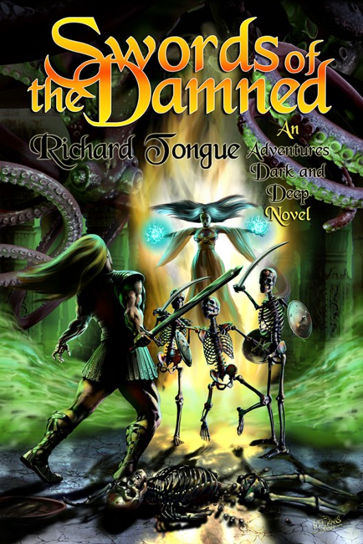
Swords of the Damned cover art © Keith Draws

Swords of the Damned cover art © Keith Draws

“The setting is a dank and dismal dungeon, illuminated by strange luminescent mold on the walls, not bright but bright enough to illuminate our heroes – the dungeon itself is an ancient tomb, strange symbols and markings carved into the cracking marble. Two heroes are engaged in battle,one of them a rougish-type fighter wearing leather armour, carrying a sword, the other a raven-haired sorceress wearing a long, flowing robe – the colour of which I leave to you, whatever you think looks best, preferably with some strange and arcane symbols on it, and her hand is raised, crackling with eldritch blue light. They are fighting some nasty skeletons – think the Harryhousen type from ‘Jason and the Argonauts’ – armed with shields and swords. There are some ‘dead’ skeletons on the ground, and some sort of horrible creature up above about to catch them by surprise.”

There is a lot going on and a lot of characters appearing in the image so how to go about bringing it to life in a way that will sell the book?

Well, the image needs to draw the viewer into the scene so a view into the temple with perceptive to draw the viewer in and lighting to create a focal point seemed like a good start.

First off I laid in a Golden Ratio 9 section Grid as a template which I would use to help balance the image.

Next, the background/temple was laid in making sure there would be enough air for the title and Author in the top “third” of the grid.

Now onto the characters. I decided to place these in layers from back to front in order to help enhance the depth. I sketched in the rough positions.

Starting with the giant octopus creature in the background, making it dark and almost unseen.

Next came Sorceress, I placed her to the right of the center section of the grid she’s kind of hovering in a dramatic almost Christlike pose, bathed in light, casting a spell. I placed a bright surge of magic power behind her that is reflected in the floor and this serves almost like vertical arrow drawing the eye up from the base right to her.

Next, I painted the green smoke surging off to the sides which also serve to lead the eye in but this time from the sides.

The next depth layer is the three skeletons were placed in the mid-distance, heads just below the centerline and slightly to the right of center. I painted then quite dark with stark highlights so they stand out well and at the same time look quite eerie.

Now comes the second hero, dodging a blow from one of the skeletons. He’s much closer to the viewer and so much bigger in the frame. I placed him below the center and in the left section of the grid. He is painted in heavy contrast creating drama while standing out from the background. There is now also a good balance of tone and shape.

The broken skeleton in the foreground again painted in high contrast adds another layer of depth while at the same time framing the base of the image.

You’ll notice that by positioning and lighting the Sorceress and the Hero as I did I made them the “Stars” of the image.

Now the rough was completed I sent it off for approval and fortunately, Richard liked it and so I went on to work it up to what you see here.

The title, series name, and Author typography were all based on the existing Series name logo. Again it took a little thought but I was able to make it all tie together with the layout of the image.

I left this until last but in hindsight, I think it’s always better to design the typography first since it can have a great impact on the final image. In this case, I was fortunate in that I had to make few changes to the overall painting, and of course, since I work digitally this is much easier to do. Had I painted this in oil I would have had a much harder time of it.

I won’t make that mistake again.

Richard’s Blog can be found here

And his Facebook is here

Posters and prints of this painting can be purchased here

Share this from Keith Draws:

  • Share on Facebook (Opens in new window) Facebook
  • Share on X (Opens in new window) X
  • Share on Pinterest (Opens in new window) Pinterest
  • Share on LinkedIn (Opens in new window) LinkedIn
  • Share on Reddit (Opens in new window) Reddit
  • Share on Tumblr (Opens in new window) Tumblr
Like Loading...

Composition: Testing layout alternatives using the “Golden Ratio” and “The Rule of Thirds.”

11 Tuesday Sep 2012

Posted by keithdraws in Book Cover Design, Composition, golden ratio, The Rule of Thirds

≈ Leave a comment

Tags

book cover, composition, Cover Art, Cover design, design, golden ratio, illustration, Keith Draws, kindle, layout, Photo compositiing, The Rule of Thirds

I mentioned here that  I’d show you how I apply the various compositional grids we’ve discussed so far on an actual cover design, so here it is. I don’t usually work with finished images but rather roughs, However I felt  it would look better for this post.

Here I’m working with images I digitally painted , but you can work with Photos in the same way. In your photo editing  software Paste two copies of any image you intend to scale, at full resolution into your art. Name one “Final Image ref no” and hide it, and name the other “rough ref no“.  Now you can scale the “rough ref no” image up and down as much as you want because this is just your rough/design image. Once you have settled on the final size and position, use this as a template to scale and position the “Final Image ref no” layer and then hide the rough.

Pro Tip: When it comes to using the final image, remember if you scale it up more than 20% bigger than its original size the quality will be reduced to a point where its not usable. Scaling down is not a problem.

I decided to work with two grids. On the left is the Golden Ratio 9 section Grid, on the right you can see The Rule of Thirds, another 9 section grid.

So I fooled around for quite a while but finally I had six variations I was fairly happy with. Again “Golden Ratio” on the left, “Rule of Thirds” on the right.

There may seem to be not a lot of difference here, but look at the placement. I’ve place the figure so she falls within the grid in a very specific way. On both versions she is occupying the left and central columns and the lowest horizontal dividing line bisects the hips just above, where her right leg flows into the right column. There are other subtle points of grid alignment that you can find if you study both images but they may differ in each image. The end result is that the figure in the Golden Ratio (on the left) is slightly smaller and is placed slightly higher. She fills just over half of the cover while in the image on the right she occupies almost 2 thirds of the cover.

At this point I also put some text in, its not going to be the final fonts but its giving me an idea of what properties the font will need and how well the title is going to work in this format. Notice the text falls higher on the page in the “Thirds” grid.

At this point I’m liking the “Golden Ratio ” more. So now its time to try further alternative:

I wondered if I could get “Book Title” across the top and so this was the result.

In Both cases I’m Filling the left vertical column and bisecting the central vertical column with the woman, leaving space at the top for the text. This was leaving a large blank space on the right that put everything out of visual balance so I placed a moon in there, bisected by the uppermost horizontal line and the furthest right vertical line. The flames are also helping to fill the grid in a balanced way.

In this case I prefer the result on the Right in the “Rule of Thirds” grid. Next I decided to try and make the text more dominant:

For me these two are too clearly divided up, but that may just be my personal bias. On the good side the title of the Book will be very clear indeed. In any case its worth studying how I’ve used the grids. Take special note of how, on the right, I have added a second grid (marked in red) within the upper two horizontal sections of the first.

By this point I now felt I had enough  information to make an informed decision and decided I like the very first layout I did. So the next stage is to refine it some more. I’m going to discuss that in my next post since there are still quite a lot of issues to be considered.

Here again is the photoshop template for you to use. Its at the correct resolution for a 6 x 9 book including bleed with overlays for both of these grids. It’s 450 DPI at actual size and includes 3mm bleed. It also includes a template for the Kindle cover format which is 1.6 and slightly different to the 6×9 cover. Right click the link to save and and Download here:

Share this from Keith Draws:

  • Share on Facebook (Opens in new window) Facebook
  • Share on X (Opens in new window) X
  • Share on Pinterest (Opens in new window) Pinterest
  • Share on LinkedIn (Opens in new window) LinkedIn
  • Share on Reddit (Opens in new window) Reddit
  • Share on Tumblr (Opens in new window) Tumblr
Like Loading...
 mailing list button
Follow keithdraws on WordPress.com

About this Blog

We post lots of great advice on how to create your own book covers. Just check the Categories bellow.
We also offer custom made covers, illustrated, photomontage or purely typographic, if you don’t want to do the work yourself.
Any questions feel free to contact us, just click the contact tab above.
If you want to support me in my illustration work go here

Categories

  • blogging for sales.
  • Book cover
  • Book Cover Design
  • Cards
  • color
  • Comic Art
  • Composition
  • E book sizes
  • Editing
  • Fantasy
  • Fantasy art
  • Fantasy ready made cover
  • General
  • golden ratio
  • High Fantasy
  • Historical fiction
  • Humor
  • Illustration.
  • Interview
  • Interviews
  • Panther
  • Photo compositing
  • Photo compositing
  • Photoshop
  • publishing
  • Science Fiction
  • The Rule of Thirds
  • Typograpghy
  • Typography
  • Typography
  • Uncategorized

Archives

  • November 2023
  • September 2023
  • June 2023
  • November 2022
  • January 2022
  • November 2021
  • August 2021
  • July 2021
  • June 2021
  • July 2020
  • March 2020
  • October 2019
  • May 2019
  • April 2019
  • December 2018
  • June 2018
  • April 2018
  • March 2018
  • November 2017
  • September 2017
  • July 2017
  • June 2017
  • September 2016
  • August 2016
  • June 2016
  • May 2016
  • January 2016
  • December 2015
  • June 2015
  • May 2015
  • April 2015
  • January 2015
  • November 2014
  • October 2014
  • September 2014
  • August 2014
  • April 2014
  • March 2014
  • February 2014
  • January 2014
  • December 2013
  • November 2013
  • July 2013
  • April 2013
  • October 2012
  • September 2012
  • August 2012

Keith Draws Cover Art on Facebook.

Keith Draws Cover Art on Facebook.

Keith Draws on Twitter.

Tweets by Keith_Draws

Recent Posts

  • The Dangers of AI.
  • Check out The Tower’s Alchemist Film Script by ALESHA ESCOBAR
  • Amazon Shadow Categories.
  • How to Paint Cosmic Horror?
  • E. M. Foner, Living Series Cover art

Meta

  • Create account
  • Log in
  • Entries feed
  • Comments feed
  • WordPress.com

Blog at WordPress.com.

  • Subscribe Subscribed
    • keithdraws
    • Join 79 other subscribers
    • Already have a WordPress.com account? Log in now.
    • keithdraws
    • Subscribe Subscribed
    • Sign up
    • Log in
    • Report this content
    • View site in Reader
    • Manage subscriptions
    • Collapse this bar
 

Loading Comments...
 

    %d