When Your Hero Approves Your Work!
The Great Todd Lockwood left me speechless!

A moment I’ll never forget.

28 Saturday May 2016
Posted in Illustration., Uncategorized
The Great Todd Lockwood left me speechless!
A moment I’ll never forget.
28 Saturday May 2016
Posted in Book cover, Fantasy art, Illustration., Science Fiction, Uncategorized
Tags
book cover, Boris, Bruce Pennington, Chris Achilleos, Chris Foss, Cover Art, Cover design, Digital art, Dream, Fantasy Art, Frank Frazetta, illustration, Jim Burns, Julie Bell, Keith Draws, Peter A. Jones, Peter Elson, pursue your dreams, Richard Tongue, Sci Fi, science Fiction, Science fiction art, Todd Lockwood
As a youth I spent hours in bookshops, looking for scifi and fantasy art on book covers. I’d find a few I liked, buy them and when I got home, I’d study the art and try to learn how to do it. I dreamed about doing that kind of art for a living.
Jim Burns, Todd Lockwood, Peter A. Jones, Chris Foss, Chris Achilleos, Frank Frazetta, Boris and Julie Bell, Bruce Pennington and Peter Elson (to name but a few) were major influences. In the past few years, I’ve even been lucky enough to get to know a few of these people.
Even more amazing I actually now get paid to do work in that genre. I produce a lot of Sci fi images for the Great and Prolific Author Richard Tongue. In fact, I’ve done more than twenty illustrations for him to date, and they just get more challenging every time.
Always pursue your dreams. It’s worth it.
Here are a few of the more recent covers I’ve done for Richard:

The Battle of Hercules cover art © Keith Draws

Interceptor cover art © Keith Draws
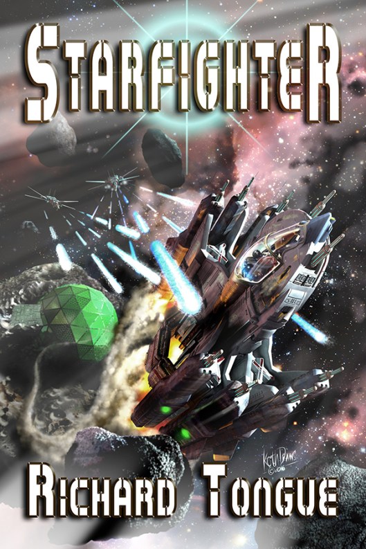
Starfighter cover art © Keith Draws

Forbidden Seas cover art © Keith Draws
07 Thursday Jan 2016
Posted in Uncategorized
Tags
battle armour, Cover Art, Fantasy Art, illustration, Keith Draws, Sci Fi, science Fiction, Secret War, shade, Shades of Vengence
One more illustration from “The Secret War” from the amazing game “Era: The Consortium.”
Depicting a “Shade” in “stealth armour”, this image is my favorite from the series and of much of the work I have done, this has probably come closest to the image I had in my mind before I started work.

The game itself has received some amazing reviews such as this one:
http://rpgknights.com/era-the-consortium-a-review/
and the kickstarter for “The Secret War” Module is getting great reviews too:
http://www.gamingcypher.com/era-the-consortium-the-secret-war-kickstarter-launches-today/
The kickstarter itself is here :
https://goo.gl/AE9hou
All images are copyright Shades of Vengeance.
01 Monday Sep 2014
Posted in Book cover, Fantasy, Fantasy art, Illustration., Science Fiction
Tags
book cover, Cover Art, Cover design, golden ratio, illustration, Keith Draws, Richard Tongue, Sci Fi, science Fiction
The cover for “Battlecruiser Alamo-Stars in the Sand” by Richard Tongue.
BCA Stars in the Sand cover art ©Keith Draws
I’m always trying to go for an updated “Amazing Stories” type image with this work since I love that stuff so much.
Posters and high res here
04 Friday Apr 2014
Posted in Book cover, color, Composition, Fantasy art, golden ratio, Illustration., Science Fiction, Typograpghy
Tags
book cover, composition, Cover Art, Cover design, Fantasy Art, golden ratio, Keith Draws, layout, Richard Tongue, Sci Fi, science Fiction, typography
When Richard approached me to do the cover for the latest book in his highly successful Science Fiction series, I have to say I was a little intimidated.
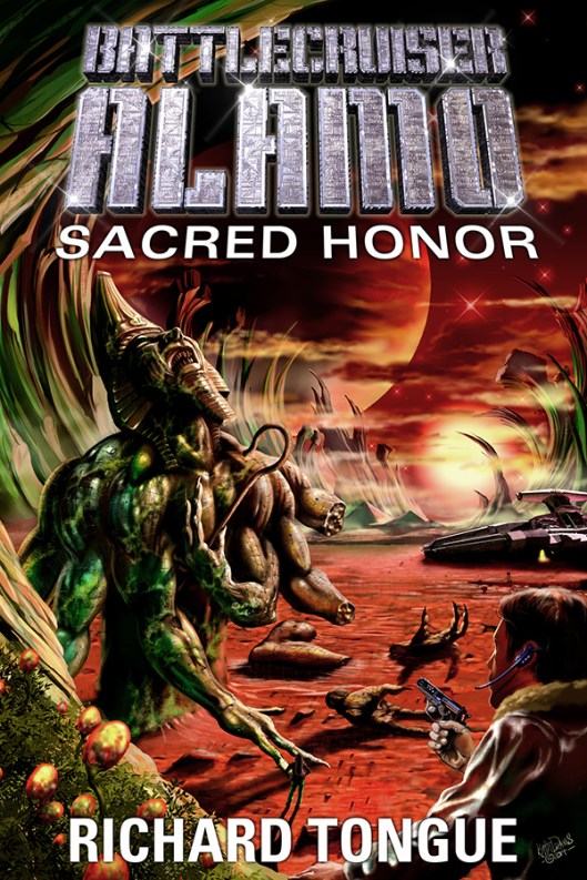
Sacred Honor cover art ©Keith Draws
The covers I’ve done for this series prior to this one I consider to be some of my best work.
How was I going to top what I’d already achieved?
I needn’t have worried though. As soon as I read the brief my mind was filled with ideas. and this is the amazing thing about working with Richard.
He has such a powerful vision., and it would bring out the best in any artist.
” The specification for Sacred Honor is a wind-swept plain, with a pair of officers looking up at a ruined, obviously alien statue – one of them Marshall, the other the woman from the cover of Price of Admiralty. (That goes back a bit!) They’re wearing uniform trousers and warmer brown jackets, pistols holstered at their belt. There is a red sun in the sky, casting a faint light. As for the statue – I haven’t got any fixed ideas on it, but I’d like it to evoke that old ‘Ozymandius – King of Kings’ quote. It is old, very old, and crumbling away; some pieces of it are on the ground, there’s a strange mould growing across some of it, pieces missing, that sort of thing.”
I immediately looked up the poem:
Shelley’s Ozymandias
“I met a traveller from an antique land
Who said: Two vast and trunkless legs of stone
Stand in the desert. Near them, on the sand,
Half sunk, a shattered visage lies, whose frown,
And wrinkled lip, and sneer of cold command,
Tell that its sculptor well those passions read
Which yet survive, stamped on these lifeless things,
The hand that mocked them and the heart that fed:
And on the pedestal these words appear:
“My name is Ozymandias, king of kings:
Look on my works, ye Mighty, and despair!”
Nothing beside remains. Round the decay
Of that colossal wreck, boundless and bare
The lone and level sands stretch far away.“
And as I opened manga studio 5 I began to think about lost and extinct alien civilizations.
First came the windswept plain and the alien sky. Distant alien mountains. Next, I began to sketch the ancient alien statue. I thought of the Egyptians, I thought of the of the great Frazetta as he painted the work of Edgar Rice Boroughs, and I began to feel a great sense of loss for the civilization that was now expired. This emotion found it’s way into the statue I was drawing who I realized was now screaming in despair.
Finally, I placed the witnesses to this tragedy, the brave explorers of Richard’s space opera. I landed their ship and sent them exploring the strange and ancient world.
Once the visual was completed I forwarded it to Richard. It looked like this: 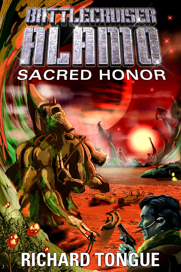
Well, fortunately, Richard liked it and so I went on to complete the work. As you can probably see I made a few minor changes but I think it came out well.
To be honest this kind of work is why I got interested in painting in the first place and I hope it inspires the sense of mystery and the intense desire to know more about the story that it does for me.
You can keep up to date with Richards work here: .http://richardtongue.blogspot.co.uk/
29 Saturday Mar 2014
Posted in Book cover, Composition, Fantasy art, golden ratio, Illustration., Science Fiction
Tags
book cover, Cover Art, Cover design, golden ratio, illustration, Keith Draws, Richard Tongue, Sci Fi, science Fiction, typography
The setting is a seedy bar on a Space station.

Triple Cross cover art ©Keith Draws
Richard asked for a “film noir” type feel to the image.
The protagonist was to be seen drawing his gun while keeping hold of his drink, meanwhile, behind him, a glamorous singer/dancer is observed by the bar crowd.
In order to get the feel I went for deep contrast in the lighting, but everything looking a little subdued by a mass of cigarette smoke (just like in the old movies).
I also realized that on a space station (that is spun to achieve gravity) it would likely be a low gravity environment. So everything had to have that slow-motion feel.
The dancer would be taking advantage of her low weight and able to make extraordinary moves while singing.
The protagonist drawing his gun knocks over the table and chair and the drinks almost float into the air.
Through the space station window, If you look carefully you can see a nod to the “Battlecruiser Alamo” Series.
To keep up to date with Richard’s books you can follow his blog here: richardtongue.blogspot.co.uk/
