• About
  • Pricing and Payment.
  • Gallery
    • Keith Draws Illustration
    • Illustrated covers
    • Children’s illustration
    • Maps and Cartography
    • Pre Designed Science Fiction, Fantasy and Horror Covers with Free typography.
    • Interior Illustration, Graphics and Concept Work
    • Photo Manipulation and Typographic covers
  • Tips to create your own cover
  • Contact
    • Join the Mailing list for 10% off
    • Contact Details
  • Editing Services
  • Terms and Conditions

keithdraws

~ Effective Cover Design and Creation Made Easy

keithdraws

Tag Archives: Photo compositiing

Amazing Cover art from under $130

15 Friday May 2015

Posted by keithdraws in Uncategorized

≈ Leave a comment

Tags

book cover, Cover Art, Cover design, illustration, Keith Draws, Photo compositiing, Special Offer, typography

Summer Specials!

To say thanks for all your support I’ve created these Summer specials:
Check it these great deals: https://goo.gl/2zpxwS before all the slots are booked.
I’ve also added character design for only $45 a character, front action view,  back and side all in full color.

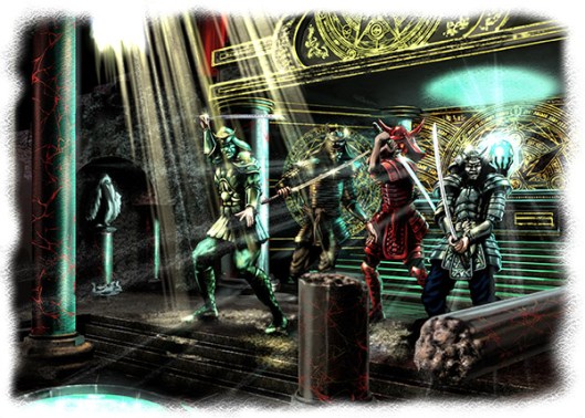
Illustration by Keith Draws: All rights belong to Shades of Vengeance

Illustration by Keith Draws: All rights belong to Shades of Vengeance

Share this from Keith Draws:

  • Share on Facebook (Opens in new window) Facebook
  • Share on X (Opens in new window) X
  • Share on Pinterest (Opens in new window) Pinterest
  • Share on LinkedIn (Opens in new window) LinkedIn
  • Share on Reddit (Opens in new window) Reddit
  • Share on Tumblr (Opens in new window) Tumblr
Like Loading...

“Desire” by P. T. Michelle

26 Wednesday Feb 2014

Posted by keithdraws in Book cover, Composition, Fantasy art, golden ratio, Illustration., Photo compositing, Photoshop, Typography

≈ Leave a comment

Tags

composition, Cover Art, Cover design, Desire, golden ratio, Keith Draws, P.T. Michelle, Photo compositiing, Photoshop, Vampire

Patrice had a very specific vision for this cover."Desire" by P. T. Michelle

She gave me the stock shot of the Main Character and together we decided I would paint everything else (including the wings).

Realism is always a challenge but I feel it was a great success, combining the best elements of both media.

Her  blog is here and her facebook is here

Share this from Keith Draws:

  • Share on Facebook (Opens in new window) Facebook
  • Share on X (Opens in new window) X
  • Share on Pinterest (Opens in new window) Pinterest
  • Share on LinkedIn (Opens in new window) LinkedIn
  • Share on Reddit (Opens in new window) Reddit
  • Share on Tumblr (Opens in new window) Tumblr
Like Loading...

Creating Gold text.

03 Wednesday Oct 2012

Posted by keithdraws in Composition, Photoshop, Typograpghy, Typography, Typography

≈ Leave a comment

Tags

book cover, cd cover, composition, Cover Art, Cover design, Gold text, Keith Draws, kindle, layout, Photo compositiing, typography

This is  a simple way to make gold text in PS. The music is a bit distracting but the technique is good.


Share this from Keith Draws:

  • Share on Facebook (Opens in new window) Facebook
  • Share on X (Opens in new window) X
  • Share on Pinterest (Opens in new window) Pinterest
  • Share on LinkedIn (Opens in new window) LinkedIn
  • Share on Reddit (Opens in new window) Reddit
  • Share on Tumblr (Opens in new window) Tumblr
Like Loading...

How to mask hair in PS5

02 Tuesday Oct 2012

Posted by keithdraws in General, Photo compositing, Photoshop

≈ Leave a comment

Tags

book cover, Cover Art, hair, Keith Draws, masking, Photo compositiing, Photoshop

This is a great video tutorial on creating a cut out mask for hair.

And this is even better:

Share this from Keith Draws:

  • Share on Facebook (Opens in new window) Facebook
  • Share on X (Opens in new window) X
  • Share on Pinterest (Opens in new window) Pinterest
  • Share on LinkedIn (Opens in new window) LinkedIn
  • Share on Reddit (Opens in new window) Reddit
  • Share on Tumblr (Opens in new window) Tumblr
Like Loading...

Free Photoshop 6 video tutorials

17 Monday Sep 2012

Posted by keithdraws in General, Photo compositing, Photoshop

≈ 2 Comments

Tags

book cover, cd cover, Cover Art, Keith Draws, Photo compositiing

I’m sure this link will be very helpful to all who want to work on photo compositing.

3D Buzz is happy to announce that the Photoshop CS6 Fundamentals class that was made freely available to the general public is now available for download… free to all!

You can find the download links here:

http://www.3dbuzz.com/vbforum/showthread.php?193870

I’ll be going through these, you can never know enough.

Share this from Keith Draws:

  • Share on Facebook (Opens in new window) Facebook
  • Share on X (Opens in new window) X
  • Share on Pinterest (Opens in new window) Pinterest
  • Share on LinkedIn (Opens in new window) LinkedIn
  • Share on Reddit (Opens in new window) Reddit
  • Share on Tumblr (Opens in new window) Tumblr
Like Loading...

Composition: Testing layout alternatives using the “Golden Ratio” and “The Rule of Thirds.”

11 Tuesday Sep 2012

Posted by keithdraws in Book Cover Design, Composition, golden ratio, The Rule of Thirds

≈ Leave a comment

Tags

book cover, composition, Cover Art, Cover design, design, golden ratio, illustration, Keith Draws, kindle, layout, Photo compositiing, The Rule of Thirds

I mentioned here that  I’d show you how I apply the various compositional grids we’ve discussed so far on an actual cover design, so here it is. I don’t usually work with finished images but rather roughs, However I felt  it would look better for this post.

Here I’m working with images I digitally painted , but you can work with Photos in the same way. In your photo editing  software Paste two copies of any image you intend to scale, at full resolution into your art. Name one “Final Image ref no” and hide it, and name the other “rough ref no“.  Now you can scale the “rough ref no” image up and down as much as you want because this is just your rough/design image. Once you have settled on the final size and position, use this as a template to scale and position the “Final Image ref no” layer and then hide the rough.

Pro Tip: When it comes to using the final image, remember if you scale it up more than 20% bigger than its original size the quality will be reduced to a point where its not usable. Scaling down is not a problem.

I decided to work with two grids. On the left is the Golden Ratio 9 section Grid, on the right you can see The Rule of Thirds, another 9 section grid.

So I fooled around for quite a while but finally I had six variations I was fairly happy with. Again “Golden Ratio” on the left, “Rule of Thirds” on the right.

There may seem to be not a lot of difference here, but look at the placement. I’ve place the figure so she falls within the grid in a very specific way. On both versions she is occupying the left and central columns and the lowest horizontal dividing line bisects the hips just above, where her right leg flows into the right column. There are other subtle points of grid alignment that you can find if you study both images but they may differ in each image. The end result is that the figure in the Golden Ratio (on the left) is slightly smaller and is placed slightly higher. She fills just over half of the cover while in the image on the right she occupies almost 2 thirds of the cover.

At this point I also put some text in, its not going to be the final fonts but its giving me an idea of what properties the font will need and how well the title is going to work in this format. Notice the text falls higher on the page in the “Thirds” grid.

At this point I’m liking the “Golden Ratio ” more. So now its time to try further alternative:

I wondered if I could get “Book Title” across the top and so this was the result.

In Both cases I’m Filling the left vertical column and bisecting the central vertical column with the woman, leaving space at the top for the text. This was leaving a large blank space on the right that put everything out of visual balance so I placed a moon in there, bisected by the uppermost horizontal line and the furthest right vertical line. The flames are also helping to fill the grid in a balanced way.

In this case I prefer the result on the Right in the “Rule of Thirds” grid. Next I decided to try and make the text more dominant:

For me these two are too clearly divided up, but that may just be my personal bias. On the good side the title of the Book will be very clear indeed. In any case its worth studying how I’ve used the grids. Take special note of how, on the right, I have added a second grid (marked in red) within the upper two horizontal sections of the first.

By this point I now felt I had enough  information to make an informed decision and decided I like the very first layout I did. So the next stage is to refine it some more. I’m going to discuss that in my next post since there are still quite a lot of issues to be considered.

Here again is the photoshop template for you to use. Its at the correct resolution for a 6 x 9 book including bleed with overlays for both of these grids. It’s 450 DPI at actual size and includes 3mm bleed. It also includes a template for the Kindle cover format which is 1.6 and slightly different to the 6×9 cover. Right click the link to save and and Download here:

Share this from Keith Draws:

  • Share on Facebook (Opens in new window) Facebook
  • Share on X (Opens in new window) X
  • Share on Pinterest (Opens in new window) Pinterest
  • Share on LinkedIn (Opens in new window) LinkedIn
  • Share on Reddit (Opens in new window) Reddit
  • Share on Tumblr (Opens in new window) Tumblr
Like Loading...

Chip Kidd’s insights

04 Tuesday Sep 2012

Posted by keithdraws in Book Cover Design

≈ Leave a comment

Tags

book cover, composition, Cover Art, Cover design, illustration, Keith Draws, layout, Photo compositiing, typography

Here are some interesting insights  from one of the more successful Book cover designers of our time, interesting and funny, despite his lopsided glasses.

From Youtube:

Chip Kidd doesn’t judge books by their cover, he creates covers that embody the book — and he does it with a wicked sense of humor. In one of the funniest talks from TED2012, he shows the art and deep thought of his cover designs. (From The Design Studio session at TED2012, guest curated by Chee Pearlman and David Rockwell.)

Share this from Keith Draws:

  • Share on Facebook (Opens in new window) Facebook
  • Share on X (Opens in new window) X
  • Share on Pinterest (Opens in new window) Pinterest
  • Share on LinkedIn (Opens in new window) LinkedIn
  • Share on Reddit (Opens in new window) Reddit
  • Share on Tumblr (Opens in new window) Tumblr
Like Loading...

Simple Photo Compositing

03 Monday Sep 2012

Posted by keithdraws in Photo compositing, Photoshop

≈ 2 Comments

Tags

book cover, cd cover, Cover Art, Cover design, illustration, Keith Draws, kindle, layout, Photo compositiing

This Video is great for a beginner, to learn some basic techniques in photo compositing.  Though it’s not mentioned in here I also recommend you get used to working at a minimum of 450 dpi at actual size. When your work is printed it will usually be at 300 dpi, so you will be working at a higher resolution. This is standard practice, and means that you work will be reduced in size when it’s finally printed. The reduction will improve the quality.

Share this from Keith Draws:

  • Share on Facebook (Opens in new window) Facebook
  • Share on X (Opens in new window) X
  • Share on Pinterest (Opens in new window) Pinterest
  • Share on LinkedIn (Opens in new window) LinkedIn
  • Share on Reddit (Opens in new window) Reddit
  • Share on Tumblr (Opens in new window) Tumblr
Like Loading...
 mailing list button
Follow keithdraws on WordPress.com

About this Blog

We post lots of great advice on how to create your own book covers. Just check the Categories bellow.
We also offer custom made covers, illustrated, photomontage or purely typographic, if you don’t want to do the work yourself.
Any questions feel free to contact us, just click the contact tab above.
If you want to support me in my illustration work go here

Categories

  • blogging for sales.
  • Book cover
  • Book Cover Design
  • Cards
  • color
  • Comic Art
  • Composition
  • E book sizes
  • Editing
  • Fantasy
  • Fantasy art
  • Fantasy ready made cover
  • General
  • golden ratio
  • High Fantasy
  • Historical fiction
  • Humor
  • Illustration.
  • Interview
  • Interviews
  • Panther
  • Photo compositing
  • Photo compositing
  • Photoshop
  • publishing
  • Science Fiction
  • The Rule of Thirds
  • Typograpghy
  • Typography
  • Typography
  • Uncategorized

Archives

  • November 2023
  • September 2023
  • June 2023
  • November 2022
  • January 2022
  • November 2021
  • August 2021
  • July 2021
  • June 2021
  • July 2020
  • March 2020
  • October 2019
  • May 2019
  • April 2019
  • December 2018
  • June 2018
  • April 2018
  • March 2018
  • November 2017
  • September 2017
  • July 2017
  • June 2017
  • September 2016
  • August 2016
  • June 2016
  • May 2016
  • January 2016
  • December 2015
  • June 2015
  • May 2015
  • April 2015
  • January 2015
  • November 2014
  • October 2014
  • September 2014
  • August 2014
  • April 2014
  • March 2014
  • February 2014
  • January 2014
  • December 2013
  • November 2013
  • July 2013
  • April 2013
  • October 2012
  • September 2012
  • August 2012

Keith Draws Cover Art on Facebook.

Keith Draws Cover Art on Facebook.

Keith Draws on Twitter.

Tweets by Keith_Draws

Recent Posts

  • The Dangers of AI.
  • Check out The Tower’s Alchemist Film Script by ALESHA ESCOBAR
  • Amazon Shadow Categories.
  • How to Paint Cosmic Horror?
  • E. M. Foner, Living Series Cover art

Meta

  • Create account
  • Log in
  • Entries feed
  • Comments feed
  • WordPress.com

Blog at WordPress.com.

  • Subscribe Subscribed
    • keithdraws
    • Join 79 other subscribers
    • Already have a WordPress.com account? Log in now.
    • keithdraws
    • Subscribe Subscribed
    • Sign up
    • Log in
    • Report this content
    • View site in Reader
    • Manage subscriptions
    • Collapse this bar
 

Loading Comments...
 

    %d