When Richard approached me to do the cover for the latest book in his highly successful Science Fiction series, I have to say I was a little intimidated.
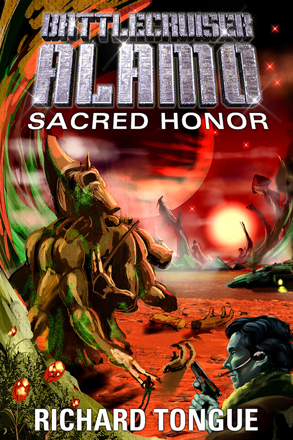
Sacred Honor cover art ©Keith Draws
The covers I’ve done for this series prior to this one I consider to be some of my best work.
How was I going to top what I’d already achieved?
I needn’t have worried though. As soon as I read the brief my mind was filled with ideas. and this is the amazing thing about working with Richard.
He has such a powerful vision., and it would bring out the best in any artist.
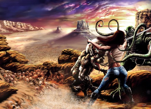
” The specification for Sacred Honor is a wind-swept plain, with a pair of officers looking up at a ruined, obviously alien statue – one of them Marshall, the other the woman from the cover of Price of Admiralty. (That goes back a bit!) They’re wearing uniform trousers and warmer brown jackets, pistols holstered at their belt. There is a red sun in the sky, casting a faint light. As for the statue – I haven’t got any fixed ideas on it, but I’d like it to evoke that old ‘Ozymandius – King of Kings’ quote. It is old, very old, and crumbling away; some pieces of it are on the ground, there’s a strange mould growing across some of it, pieces missing, that sort of thing.”
I immediately looked up the poem:
Shelley’s Ozymandias
“I met a traveller from an antique land
Who said: Two vast and trunkless legs of stone
Stand in the desert. Near them, on the sand,
Half sunk, a shattered visage lies, whose frown,
And wrinkled lip, and sneer of cold command,
Tell that its sculptor well those passions read
Which yet survive, stamped on these lifeless things,
The hand that mocked them and the heart that fed:
And on the pedestal these words appear:
“My name is Ozymandias, king of kings:
Look on my works, ye Mighty, and despair!”
Nothing beside remains. Round the decay
Of that colossal wreck, boundless and bare
The lone and level sands stretch far away.“
And as I opened manga studio 5 I began to think about lost and extinct alien civilizations.
First came the windswept plain and the alien sky. Distant alien mountains. Next, I began to sketch the ancient alien statue. I thought of the Egyptians, I thought of the of the great Frazetta as he painted the work of Edgar Rice Boroughs, and I began to feel a great sense of loss for the civilization that was now expired. This emotion found it’s way into the statue I was drawing who I realized was now screaming in despair.
Finally, I placed the witnesses to this tragedy, the brave explorers of Richard’s space opera. I landed their ship and sent them exploring the strange and ancient world.
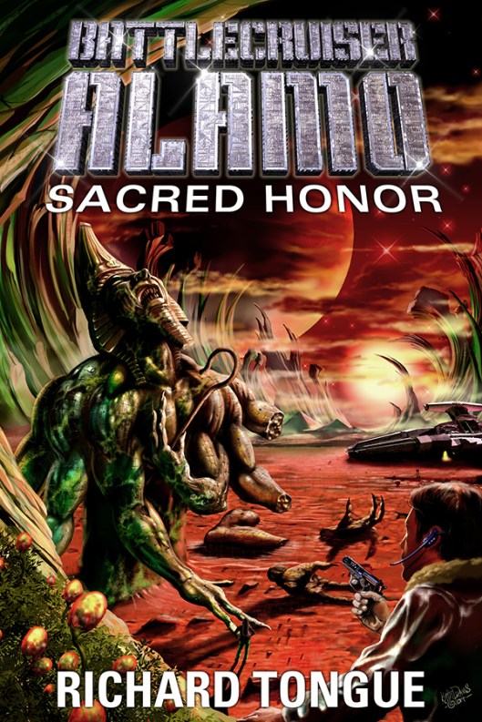
Once the visual was completed I forwarded it to Richard. It looked like this: 
Well, fortunately, Richard liked it and so I went on to complete the work. As you can probably see I made a few minor changes but I think it came out well.
To be honest this kind of work is why I got interested in painting in the first place and I hope it inspires the sense of mystery and the intense desire to know more about the story that it does for me.
You can keep up to date with Richards work here: .http://richardtongue.blogspot.co.uk/
Posters and prints of this image are available here
Share this from Keith Draws: