• About
  • Pricing and Payment.
  • Gallery
    • Keith Draws Illustration
    • Illustrated covers
    • Children’s illustration
    • Maps and Cartography
    • Pre Designed Science Fiction, Fantasy and Horror Covers with Free typography.
    • Interior Illustration, Graphics and Concept Work
    • Photo Manipulation and Typographic covers
  • Tips to create your own cover
  • Contact
    • Join the Mailing list for 10% off
    • Contact Details
  • Editing Services
  • Terms and Conditions

keithdraws

~ Effective Cover Design and Creation Made Easy

keithdraws

Tag Archives: design

“Punishment” by Guerin Zand

24 Sunday Sep 2017

Posted by keithdraws in Illustration., Science Fiction

≈ 4 Comments

Tags

alien, Chris Foss, design, Digital art, Fantasy, fantasy woman, Frank Frazetta, Jim Burns, Keith Draws, Peter A. Jones, Peter Elson, Sci Fi, science fantasy, science Fiction, Science fiction art, science fiction illustration, sexy woman, superhero woman, Todd Lockwood

Following the theme of the first book “Child’s Play“, Guerin asked me to show how the main character (and possibly the whole of Earth) is punished for their bad behavior by the Alien Race, who guide human advancement in the background- Mainly through the actions of Guerin’s Nemesis, Julie of the Bree.  I decided to take the viewpoint of a child being told off by their mother:

Punishment cover art © Keith Draws

Punishment cover art © Keith Draws

The book is on sale here and if you get there quick enough it’s free and it’s a great read.

Once again you can see many of my influences there. My buddy Jim Burns (alien tech and just pure astounding difference) , Chris Foss and Peter Elson (for the sheer massive scale and detail they can imbue in their work), Peter A. Jones ( for the dynamism and the colour), Todd Lockwood (whose painting technique and compositional sense astounding to me) and once again Frank Frazetta (who achieves sexy, and dynamic with sheer class).

Posters are available here: https://keithdraws.deviantart.com/art/Punishment-by-Guerin-Zand-706231250

Share this from Keith Draws:

  • Share on Facebook (Opens in new window) Facebook
  • Share on X (Opens in new window) X
  • Share on Pinterest (Opens in new window) Pinterest
  • Share on LinkedIn (Opens in new window) LinkedIn
  • Share on Reddit (Opens in new window) Reddit
  • Share on Tumblr (Opens in new window) Tumblr
Like Loading...

Galileo’s Step Daughter by Amanda McCarter

19 Tuesday Aug 2014

Posted by keithdraws in Book cover, Fantasy, Fantasy art, Illustration., Science Fiction

≈ Leave a comment

Tags

Amanda McCarter, book cover, Cover Art, Cover design, design, Keith Draws, kindle, layout

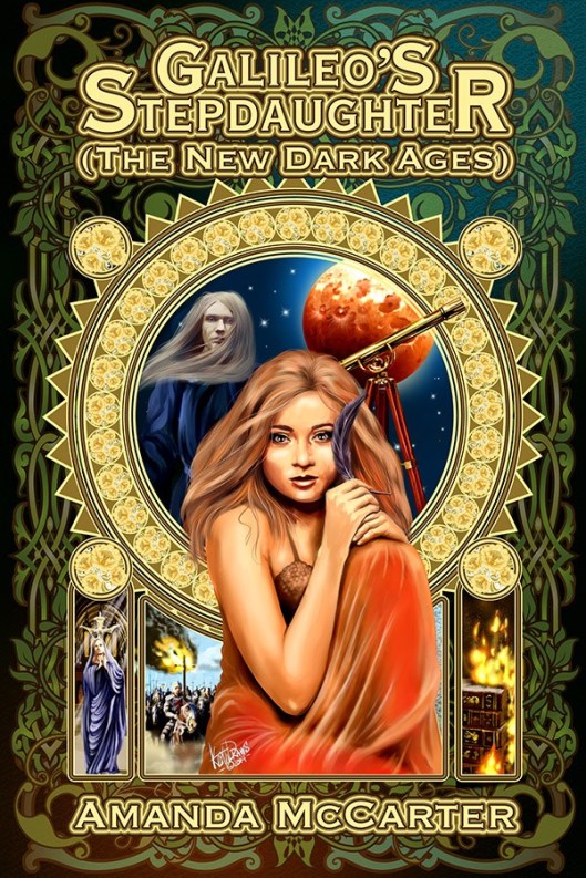
This is the cover for “Galileo’s Step Daughter” by Amanda McCarter.

The first of a Trilogy for which I am producing all the covers.

Galileo's Stepdaughter cover art ©Keith Draws

Galileo’s Stepdaughter cover art ©Keith Draws

I’m using key elements and characters from the story.
The style is inspired somewhat by the work of Mucha.

Posters available here: http://fav.me/d7vt28o

Share this from Keith Draws:

  • Share on Facebook (Opens in new window) Facebook
  • Share on X (Opens in new window) X
  • Share on Pinterest (Opens in new window) Pinterest
  • Share on LinkedIn (Opens in new window) LinkedIn
  • Share on Reddit (Opens in new window) Reddit
  • Share on Tumblr (Opens in new window) Tumblr
Like Loading...

John DeJordy’s “Transitions”

26 Wednesday Feb 2014

Posted by keithdraws in Book cover, Fantasy art, golden ratio, Illustration., Typograpghy

≈ Leave a comment

Tags

book cover, composition, Cover Art, Cover design, design, golden ratio, illustration, John DeJordy, Keith Draws, Library, Transitions, typography

John gave me the following Brief:

Transitions cover art ©Keith Draws

Transitions cover art ©Keith Draws

“The setting is an elegant library with carved rosewood–as if the Sistine Chapel and a library crossed.

The focus, though, is on a painting hanging on the wall.

It is of a woman, wearing a beautiful, full-length gown as if going to a ball, and she is holding a deep-red rose. She has long, black hair and green eyes.

The portrait should have Diane sitting down, looking toward the spine of the book. Behind her, in the painting, a forest green (or some green that looks nice) tapestry with a unicorn (just enough to recognize it as such, if possible.

Diane has a slender nose and hypnotic eyes, and a wonderful smile. The smile is important. It doesn’t have to show teeth, just obviously a smile. She should be wearing a corset. The library, which I assume would be mostly on the back, would be of books and scrolls.”

To create the library I started with the amazing free “3D Mandelbulb Ray Tracer”.

It’s an amazing tool and it lets you create extraordinary images with a little patience.MANDELBULB

I made multiple renders and edited them together to create the basic structure and then went on to add lots of details.

Inspiration can come from many places.

Johns Blog can be found here: http://johndejordy.com/
and his facebook:  https://www.facebook.com/john.dejordy

Posters and prints of this image here

Share this from Keith Draws:

  • Share on Facebook (Opens in new window) Facebook
  • Share on X (Opens in new window) X
  • Share on Pinterest (Opens in new window) Pinterest
  • Share on LinkedIn (Opens in new window) LinkedIn
  • Share on Reddit (Opens in new window) Reddit
  • Share on Tumblr (Opens in new window) Tumblr
Like Loading...

“Swords of the Damned” by Richard Tongue

24 Monday Feb 2014

Posted by keithdraws in Book cover, color, Composition, Fantasy art, golden ratio, Illustration., Typography

≈ Leave a comment

Tags

book cover, composition, Cover Art, Cover design, design, Fantasy Art, golden ratio, illustration, Keith Draws, kindle, Kobo, layout, Photoshop, The Rule of Thirds, typography

I’ve been working with Richard for quite some time and he usually gives me quite a free hand with what I do, but not this time.

Getting a brief like this can be quite intimidating:

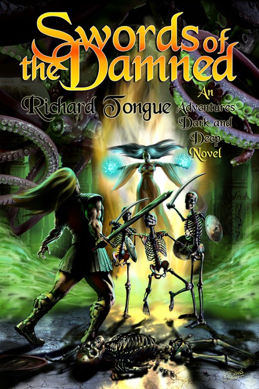
Swords of the Damned cover art © Keith Draws

Swords of the Damned cover art © Keith Draws

“The setting is a dank and dismal dungeon, illuminated by strange luminescent mold on the walls, not bright but bright enough to illuminate our heroes – the dungeon itself is an ancient tomb, strange symbols and markings carved into the cracking marble. Two heroes are engaged in battle,one of them a rougish-type fighter wearing leather armour, carrying a sword, the other a raven-haired sorceress wearing a long, flowing robe – the colour of which I leave to you, whatever you think looks best, preferably with some strange and arcane symbols on it, and her hand is raised, crackling with eldritch blue light. They are fighting some nasty skeletons – think the Harryhousen type from ‘Jason and the Argonauts’ – armed with shields and swords. There are some ‘dead’ skeletons on the ground, and some sort of horrible creature up above about to catch them by surprise.”

There is a lot going on and a lot of characters appearing in the image so how to go about bringing it to life in a way that will sell the book?

Well, the image needs to draw the viewer into the scene so a view into the temple with perceptive to draw the viewer in and lighting to create a focal point seemed like a good start.

First off I laid in a Golden Ratio 9 section Grid as a template which I would use to help balance the image.

Next, the background/temple was laid in making sure there would be enough air for the title and Author in the top “third” of the grid.

Now onto the characters. I decided to place these in layers from back to front in order to help enhance the depth. I sketched in the rough positions.

Starting with the giant octopus creature in the background, making it dark and almost unseen.

Next came Sorceress, I placed her to the right of the center section of the grid she’s kind of hovering in a dramatic almost Christlike pose, bathed in light, casting a spell. I placed a bright surge of magic power behind her that is reflected in the floor and this serves almost like vertical arrow drawing the eye up from the base right to her.

Next, I painted the green smoke surging off to the sides which also serve to lead the eye in but this time from the sides.

The next depth layer is the three skeletons were placed in the mid-distance, heads just below the centerline and slightly to the right of center. I painted then quite dark with stark highlights so they stand out well and at the same time look quite eerie.

Now comes the second hero, dodging a blow from one of the skeletons. He’s much closer to the viewer and so much bigger in the frame. I placed him below the center and in the left section of the grid. He is painted in heavy contrast creating drama while standing out from the background. There is now also a good balance of tone and shape.

The broken skeleton in the foreground again painted in high contrast adds another layer of depth while at the same time framing the base of the image.

You’ll notice that by positioning and lighting the Sorceress and the Hero as I did I made them the “Stars” of the image.

Now the rough was completed I sent it off for approval and fortunately, Richard liked it and so I went on to work it up to what you see here.

The title, series name, and Author typography were all based on the existing Series name logo. Again it took a little thought but I was able to make it all tie together with the layout of the image.

I left this until last but in hindsight, I think it’s always better to design the typography first since it can have a great impact on the final image. In this case, I was fortunate in that I had to make few changes to the overall painting, and of course, since I work digitally this is much easier to do. Had I painted this in oil I would have had a much harder time of it.

I won’t make that mistake again.

Richard’s Blog can be found here

And his Facebook is here

Posters and prints of this painting can be purchased here

Share this from Keith Draws:

  • Share on Facebook (Opens in new window) Facebook
  • Share on X (Opens in new window) X
  • Share on Pinterest (Opens in new window) Pinterest
  • Share on LinkedIn (Opens in new window) LinkedIn
  • Share on Reddit (Opens in new window) Reddit
  • Share on Tumblr (Opens in new window) Tumblr
Like Loading...

“Weapons of Power” By David J. Normoyle.

16 Sunday Feb 2014

Posted by keithdraws in Book cover, color, Composition, Fantasy art, golden ratio, Illustration., The Rule of Thirds

≈ Leave a comment

Tags

book cover, composition, Cover Art, Cover design, design, Fantasy Art, golden ratio, illustration, Keith Draws, Magic, Wizard

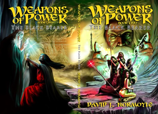
“Weapons of Power”, Book 1 “The Silver Portal” and Book 2 “The Black Bearer” By David J. Normoyle.

This is the first and second part of an exciting young adult fantasy trilogy for which I am producing the covers."Weapons Of Power" Book One "The Silver Portal" by David J. Normoyle

Obviously, when designing a series we have to think about how we are going to keep a consistent feel throughout all of the covers. They need to look like part of a series while at the same time looking exciting and new. Not as simple as it sounds.

David gave me the synopsis of the books and after some discussion we decided to go for a kind of classic film poster format, featuring the main characters and locations that appear in the particular books. It’s also a good idea to hint at the kind of adventure the reader will experience when reading the books.

The intention when designing covers like this is to create a kind of film trailer effect on the viewer, leaving them with a mind filled with excitement and questions they want to know the answers for.

weapons of power book 1 cover art © Keith Draws

Weapons of Power book 1 cover art © Keith Draws

With that in mind, it’s essential to achieve a well-balanced layout, as well as a pleasing tonal and color balance, in order to draw the viewers eye in.

Weapons of Power Book 2 Cover art © Keith Draws

Weapons of Power Book 2 Cover art © Keith Draws

David designed and provided me with the excellent“Weapons of Power” Logo for the series. It’s always important to ensure that the space allotted for title and Author is going to work well and be readable at all viewing sizes. Segregation of the cover using the rule of thirds or as I did for these covers, the more complex (but also more aesthetically pleasing) Golden ratios is always a good way to determine the best location for the Typography.

The color can really set the mood and it also works on many other subconscious levels. The use of complementary colors balancing out across the layout, and the tonal contrast variations in these paintings all help to draw the eye in creating depth movement and flow across the image. (more about color here)

Weapons of Power book 2 cover art © Keith Draws

Weapons of Power book 2 cover art © Keith Draws

Finally when it comes to the actual image (especially for this kind of genre) it can be useful to implement quite a lot of detail in order to keep the viewer engaged and another trick is to try to add glimpses in to landscape of the world in the fantasy that create the desire to enter the image and see more. Although these covers are paintings it’s quite possible to do this with a photo montage and not near as much skill is required.

David’s  Website is  http://www.davidjnormoyle.com/ and facebook is http://www.facebook.com/DavidJNormoyle

Prints and posters of the paintings are available here:

“Weapons of Power”, Book 1 “The Silver Portal” Front and back

“Weapons of Power”, Book 1 “The Silver Portal” Front only

“Weapons of Power”, Book 2 “The Black Bearer” Front and back

“Weapons of Power”, Book 2 “The Black Bearer” Front only
Thanks to http://skydancer-stock.deviantart.com/ for the great reference of Wizards.
Thanks to Marcus Ranum who provides Great Stock photography FOC on DeviantArt which I used for Reference;
Also Thanks to the Model Laura Preciado who posed for the character of
Suma – the woman with the Axe.

Share this from Keith Draws:

  • Share on Facebook (Opens in new window) Facebook
  • Share on X (Opens in new window) X
  • Share on Pinterest (Opens in new window) Pinterest
  • Share on LinkedIn (Opens in new window) LinkedIn
  • Share on Reddit (Opens in new window) Reddit
  • Share on Tumblr (Opens in new window) Tumblr
Like Loading...

“Walking Away From The King” by Mike Penney.

12 Wednesday Feb 2014

Posted by keithdraws in Book cover, Composition, Fantasy art, golden ratio, Illustration.

≈ Leave a comment

Tags

book cover, composition, Cover Art, design, golden ratio, illustration, Keith Draws, kindle, Kobo, layout, Lulu, typography

Mike had a very strong idea for this image and

Walking away from the King cover art © Keith Draws

Walking away from the King cover art © Keith Draws

went as far as giving me a diagram showing me what elements would be involved.

I’ll be honest, it was quite a scary brief. I’d never done anything like this before and converting a diagram into an interesting and hopefully captivating image seemed very daunting.

Alan Moore once said (and I’m paraphrasing because I’m too lazy to look up his actual words):

“Push the boundaries of your skills, always try to work outside of your comfort zone and in that way you will continue to grow as an artist.”

So with that in mind I got stuck in.

The composition was a challenge. I thought about those old Chinese landscape paintings guó huà and the way they are almost in layers from top to bottom achieving great depth (though with unusual perspective).

Departure Herald-Ming Dynasty

Source: By Anonymous (National Palace Museum) [Public domain], via Wikimedia Commons

I decided to try something similar but rather than create a weird perspective I simply changed the curvature of the earth so we can see much further. Using layers of content I built up the depth and of course, I continued to use golden ratios to help with the balance of shape, color, and contrast.

Prints and poster of this image are available here

Share this from Keith Draws:

  • Share on Facebook (Opens in new window) Facebook
  • Share on X (Opens in new window) X
  • Share on Pinterest (Opens in new window) Pinterest
  • Share on LinkedIn (Opens in new window) LinkedIn
  • Share on Reddit (Opens in new window) Reddit
  • Share on Tumblr (Opens in new window) Tumblr
Like Loading...

Composition: Testing layout alternatives using the “Golden Ratio” and “The Rule of Thirds.”

11 Tuesday Sep 2012

Posted by keithdraws in Book Cover Design, Composition, golden ratio, The Rule of Thirds

≈ Leave a comment

Tags

book cover, composition, Cover Art, Cover design, design, golden ratio, illustration, Keith Draws, kindle, layout, Photo compositiing, The Rule of Thirds

I mentioned here that  I’d show you how I apply the various compositional grids we’ve discussed so far on an actual cover design, so here it is. I don’t usually work with finished images but rather roughs, However I felt  it would look better for this post.

Here I’m working with images I digitally painted , but you can work with Photos in the same way. In your photo editing  software Paste two copies of any image you intend to scale, at full resolution into your art. Name one “Final Image ref no” and hide it, and name the other “rough ref no“.  Now you can scale the “rough ref no” image up and down as much as you want because this is just your rough/design image. Once you have settled on the final size and position, use this as a template to scale and position the “Final Image ref no” layer and then hide the rough.

Pro Tip: When it comes to using the final image, remember if you scale it up more than 20% bigger than its original size the quality will be reduced to a point where its not usable. Scaling down is not a problem.

I decided to work with two grids. On the left is the Golden Ratio 9 section Grid, on the right you can see The Rule of Thirds, another 9 section grid.

So I fooled around for quite a while but finally I had six variations I was fairly happy with. Again “Golden Ratio” on the left, “Rule of Thirds” on the right.

There may seem to be not a lot of difference here, but look at the placement. I’ve place the figure so she falls within the grid in a very specific way. On both versions she is occupying the left and central columns and the lowest horizontal dividing line bisects the hips just above, where her right leg flows into the right column. There are other subtle points of grid alignment that you can find if you study both images but they may differ in each image. The end result is that the figure in the Golden Ratio (on the left) is slightly smaller and is placed slightly higher. She fills just over half of the cover while in the image on the right she occupies almost 2 thirds of the cover.

At this point I also put some text in, its not going to be the final fonts but its giving me an idea of what properties the font will need and how well the title is going to work in this format. Notice the text falls higher on the page in the “Thirds” grid.

At this point I’m liking the “Golden Ratio ” more. So now its time to try further alternative:

I wondered if I could get “Book Title” across the top and so this was the result.

In Both cases I’m Filling the left vertical column and bisecting the central vertical column with the woman, leaving space at the top for the text. This was leaving a large blank space on the right that put everything out of visual balance so I placed a moon in there, bisected by the uppermost horizontal line and the furthest right vertical line. The flames are also helping to fill the grid in a balanced way.

In this case I prefer the result on the Right in the “Rule of Thirds” grid. Next I decided to try and make the text more dominant:

For me these two are too clearly divided up, but that may just be my personal bias. On the good side the title of the Book will be very clear indeed. In any case its worth studying how I’ve used the grids. Take special note of how, on the right, I have added a second grid (marked in red) within the upper two horizontal sections of the first.

By this point I now felt I had enough  information to make an informed decision and decided I like the very first layout I did. So the next stage is to refine it some more. I’m going to discuss that in my next post since there are still quite a lot of issues to be considered.

Here again is the photoshop template for you to use. Its at the correct resolution for a 6 x 9 book including bleed with overlays for both of these grids. It’s 450 DPI at actual size and includes 3mm bleed. It also includes a template for the Kindle cover format which is 1.6 and slightly different to the 6×9 cover. Right click the link to save and and Download here:

Share this from Keith Draws:

  • Share on Facebook (Opens in new window) Facebook
  • Share on X (Opens in new window) X
  • Share on Pinterest (Opens in new window) Pinterest
  • Share on LinkedIn (Opens in new window) LinkedIn
  • Share on Reddit (Opens in new window) Reddit
  • Share on Tumblr (Opens in new window) Tumblr
Like Loading...

Composition: Using color to your advantage.

10 Monday Sep 2012

Posted by keithdraws in Book Cover Design, color, Composition

≈ Leave a comment

Tags

book cover, Cover Art, design

Color theory is a complex subject, but over several posts,  I’m going to try and break it down to what is important to you when designing  covers.

So just how important is using color on your cover?

Take a look at these interesting statistics:

Tests indicate that a black and white image may sustain interest for less than two-thirds a second, whereas a colored image may hold the attention for two seconds or more. (A product has one-twentieth of a second to halt the customer’s attention on a shelf or display.)

Source: Jill Morton, Colorcom

So basically using color you are getting 6 times as much attention from your potential reader than if you used a monotone image.

Ads in color are read up to 42% more often than the same ads in black and white (as shown in study on phone directory ads).

Source: White, Jan V., Color for Impact, Strathmoor Press, April, 1997

Now you are probably thinking: “but we are talking about a book cover not an ad, how is that possibly relevant?” Well if you think about it, a book cover is an advertisement for the book it appears on.  And just like an ad, its going to sit among a lot of other images trying to grab your attention, Whether it’s on a shelf or in a virtual shelf such as the amazon bookstore.

Color can improve readership by 40 percent 1, learning from 55 to 78 percent 2, and comprehension by 73 percent3.

Sources:
(1)”Business Papers in Color. Just a Shade Better”, Modern Office Technology, July 1989, Vol. 34, No. 7, pp. 98-102
(2) Embry, David, “The Persuasive Properties of Color”, Marketing Communications, October 1984.
(3) Johnson, Virginia, “The Power of Color”, Successful Meetings, June 1992, Vol 41, No. 7, pp. 87, 90.

And though this bit of research was talking about Newspapers and Magazines I think its inclusion here is self explanatory. This is actually presenting a good case for including color in the body of your book too, and with e books this can be done at no extra cost. I’ll look into this in a later post.

Psychologists have documented that “living color” does more than appeal to the senses. It also boosts memory of the subject viewed.

Source:  May 2002 issue of the Journal of Experimental Psychology: Learning, Memory and Cognition, published by the American Psychological Association (APA)
“The Contributions of Color to Recognition Memory for Natural Scenes,” Felix A. Wichmann, Max-Planck Institut für Biologische Kybernetik and Oxford University; Lindsay T. Sharpe, Universität Tübingen and University of Newcastle; and Karl R. Gegenfurtner, Max-Plank Institut für Biologische Kybernetik and Justus-Liebig-Universität Giessen; Journal of Experimental Psychology – Learning, Memory and Cognition, Vol 28. No.3., 5-May-2002

You want people to remember your book? Well that’s more likely to happen if you have a color cover.

92% Believe color presents an image of impressive quality
90% Feel color can assist in attracting new customers
90% Believe customers remember presentations and documents better when color is used
83% Believe color makes them appear more successful
81% Think color gives them a competitive edge
76% Believe that the use of color makes their business appear larger to clients

Source: Conducted by Xerox Corporation and International Communications Research from February 19, 2003 to March 7, 2003, margin of error of +/- 3.1%.

Again this information speaks for its self.

Vision is the primary source for all our experiences. (Current marketing research has reported that approximately 80% of what we assimilate through the senses, is visual.)

Source: Jill Morton, Colorcom
This means if we don’t use color on the cover we reducing the chances of visual assimilation by 80%.

So basically if you were thinking of using sepia tone, de-saturated images  or any other monotone format on your cover I think its safe to say it might be worth re thinking that idea.

Share this from Keith Draws:

  • Share on Facebook (Opens in new window) Facebook
  • Share on X (Opens in new window) X
  • Share on Pinterest (Opens in new window) Pinterest
  • Share on LinkedIn (Opens in new window) LinkedIn
  • Share on Reddit (Opens in new window) Reddit
  • Share on Tumblr (Opens in new window) Tumblr
Like Loading...

Composition: Using the Rule of Thirds on your Cover

08 Saturday Sep 2012

Posted by keithdraws in Book Cover Design, Composition, golden ratio, The Rule of Thirds

≈ 10 Comments

Tags

book cover, cd cover, composition, Cover Art, Cover design, design, golden ratio, Keith Draws, kindle

This is a very simple template that can enhance your layout substantially.

It can be used on any format and it can also be broken down into further thirds sections, but more of that later. First lets look at the template when applied to a standard 6 x 9 book cover.

Standard 6×9 book, “thirds” grid.

The rule of thirds was first written down by John Thomas Smith in 1797. In his book Remarks on Rural Scenery, Smith quotes a 1783 work by Sir Joshua Reynolds, in which Reynolds discusses, in unquantified terms, the balance of dark and light in a painting. Smith then continues with an expansion on the idea, naming it the ‘Rule of thirds’:

Two distinct, equal lights, should never appear in the same picture: One should be principal, and the rest sub-ordinate, both in dimension and degree: Unequal parts and gradations lead the attention easily from part to part, while parts of equal appearance hold it awkwardly suspended, as if unable to determine which of those parts is to be considered as the subordinate. “And to give the utmost force and solidity to your work, some part of the picture should be as light, and some as dark as possible: These two extremes are then to be harmonized and reconciled to each other. (Reynolds’ Annot. On Du Fresnoy.)

Analogous to this “Rule of thirds”, (if I may be allowed so to call it) I have presumed to think that, in connecting or in breaking the various lines of a picture, it would likewise be a good rule to do it, in general, by a similar scheme of proportion; for example, in a design of landscape, to determine the sky at about two-thirds ; or else at about one-third, so that the material objects might occupy the other two : Again, two thirds of one element, (as of water) to one third of another element (as of land); and then both together to make but one third of the picture, of which the two other thirds should go for the sky and aerial perspectives. This rule would likewise apply in breaking a length of wall, or any other too great continuation of line that it may be found necessary to break by crossing or hiding it with some other object : In short, in applying this invention, generally speaking, or to any other case, whether of light, shade, form, or color, I have found the ratio of about two thirds to one third, or of one to two, a much better and more harmonizing proportion, than the precise formal half, the two-far-extending four fifths and, in short, than any other proportion whatever. I should think myself honored by the opinion of any gentleman on this point; but until I shall by better informed, shall conclude this general proportion of two and one to be the most pictoresque medium in all cases of breaking or otherwise qualifying straight lines and masses and groupes , as is agreed to be the most beautiful, (or, in other words, the most pictoresque) medium of curves

Source: http://en.wikipedia.org/wiki/Rule_of_thirds

Basically what he’s saying is only have one center of focus and everything else in the image should serve to complement it and guide the eye toward it. Using this grid should help an artist (you in this case) balance the image. I’ll talk about color and contrast in more detail in a later post.

That’s easily said, even using this grid to create a balanced and pleasing image is not always as easy as it sounds so its always worth experimenting with it.

I’ve created some simple layouts guides to help you in some small way, I recommend you experiment further:

Remember earlier when I said: “ it can also be broken down into further thirds sections”

Here are a couple of examples of that:

And now here are a few examples of actual books with the rule of thirds applied on the cover:

The Golden Ratio Nine section gird

It’s also possible to adapt the Golden Ratio into a 9 section grid for your cover. You simply take four Golden rectangles and overlay them as shown below:

I actually prefer it to the standard “Rule of Thirds” and I’m working on a cover using this format right now, so I’ll post it as soon as its done showing you some of the design decisions I was faced with when I produced it. I’ll talk about color and contrast in more detail in a later post.

Finally, I’m giving you a photoshop template at the correct resolution for a 6 x 9 book including bleed with overlays for both of these grids. It’s 450 DPI at actual size and includes 3mm bleed. It also includes a template for the Kindle cover format which is 1.6 and slightly different to the 6×9 cover. Right-click the link to save and Download here:

Okay, I think that’s it for now, I hope this is helpful to you.

Share this from Keith Draws:
  • Share on Facebook (Opens in new window) Facebook
  • Share on X (Opens in new window) X
  • Share on Pinterest (Opens in new window) Pinterest
  • Share on LinkedIn (Opens in new window) LinkedIn
  • Share on Reddit (Opens in new window) Reddit
  • Share on Tumblr (Opens in new window) Tumblr
Like Loading...

Composition: Using the Golden Ratio on your Cover

02 Sunday Sep 2012

Posted by keithdraws in Book Cover Design, golden ratio, Typography

≈ 4 Comments

Tags

book cover, cd cover, composition, Cover Art, design, golden ratio, illustration, kindle, layout, typography

There is a lot of mystical talk about the Golden Ratio:

The Golden Ratio is also known as the Golden Mean, Phi, or Divine Proportion, this law was made famous by Leonardo Fibonacci around 1200 A.D. He noticed that there was an absolute ratio that appears often throughout nature, a sort of design that is universally efficient in living things and pleasing to the human eye. Hence, the “divine proportion” nickname.

source: digital-photography-school.com

But we are not really concerned with all the mysticism and math here: We are simply concerned with how to make a good cover design. So how does it concern us? Well if you divide the imagery up on your cover using this method you end up with a very pleasing and well balanced image.

The Grid looks like this:

And If you want some evidence of just how well it works:
The cover for “The Help” by Kathryn Stockett looks like it was designed using this principle and according to USA today it was the number one selling book of 2011. Of course, that may have a little to do with the writing as well, but that cover really did grab the attention of potential readers.

A golden rectangle can be drawn out using a straightedge and a compass like this (see below):

  1. Draw a square
  2. Draw a line from the midpoint of one side of the square to an opposite corner
  3. Use that line as the radius to draw an arc that defines the height of the rectangle
  4. now you can draw the golden rectangle with the correct proportions.

You can use the grid anyway round you like, horizontally, vertically, flipped and even in multiples at angles as it is seen in the sunflower. Of course, I recommend keeping things simple, it’s less risky.

The next thing to consider is the proportions of your cover. A paperback book cover, though close, is not quite of the same proportions as the Golden Rectangle. But this doesn’t mean you can’t use it. In the diagram below the green area represents a standard Kindle book cover, and I’ve shown two possible alternative uses of the format. One is scaled down proportionally (as on the cover of “The Help”) and another is scaled vertically in order to use all the books space, this I will call a “Butchered” Golden Rectangle. It still leads to good quality composition, but it’s not quite as aesthetically pleasing.

The same thing applies to CD covers, though the square format is very different making things slightly more problematic as can be seen in the diagrams below.

If you are wondering why this particular compositional model is so appealing, well there are many theories, but nothing is confirmed. Personally, I think its got a lot to do with the subconscious human skill of detecting patterns, and the more perfect the pattern the more we like it.

That said, imperfect patterns such as a “Butchered” Golden Ratio still appeal because they do have internal consistency and a detectable pattern.

Here you can see how I’ve used the Golden Ratio on a recent book cover. I kept it in proportion matching the width of the book but allowing it to bleed just a little above and below the page. Look at the key elements of the cover. The typography; and how the focus is drawn into the word “Rebirth” The way the eye is bisected between the first square and second golden rectangle, the way the beard, nose, and brow follow the curve of the spiral. The way the front edge of the base of the ear bisects the central square, and so on. I’m sure you can spot much more.

Its also possible to use the Golden ratio in your Typography (i.e. with your fonts and text layout) not only on the cover but actually in your book and there is a great blog piece by Chris Pearson about just that right here:  http://www.pearsonified.com/2011/12/golden-ratio-typography.php

I’m going to continue to explore all the other compositional grids, methods and techniques in future posts and with a bit of luck by the end of it all we will all be better cover designers.

If you enjoyed this article and perhaps found some help in here I’d appreciate a Facebook “share” and or “like” and one in as many other social networks as you can bring yourself to click on.

And finally back to the mysticism.

Share this from Keith Draws:

  • Share on Facebook (Opens in new window) Facebook
  • Share on X (Opens in new window) X
  • Share on Pinterest (Opens in new window) Pinterest
  • Share on LinkedIn (Opens in new window) LinkedIn
  • Share on Reddit (Opens in new window) Reddit
  • Share on Tumblr (Opens in new window) Tumblr
Like Loading...
← Older posts
 mailing list button
Follow keithdraws on WordPress.com

About this Blog

We post lots of great advice on how to create your own book covers. Just check the Categories bellow.
We also offer custom made covers, illustrated, photomontage or purely typographic, if you don’t want to do the work yourself.
Any questions feel free to contact us, just click the contact tab above.
If you want to support me in my illustration work go here

Categories

  • blogging for sales.
  • Book cover
  • Book Cover Design
  • Cards
  • color
  • Comic Art
  • Composition
  • E book sizes
  • Editing
  • Fantasy
  • Fantasy art
  • Fantasy ready made cover
  • General
  • golden ratio
  • High Fantasy
  • Historical fiction
  • Humor
  • Illustration.
  • Interview
  • Interviews
  • Panther
  • Photo compositing
  • Photo compositing
  • Photoshop
  • publishing
  • Science Fiction
  • The Rule of Thirds
  • Typograpghy
  • Typography
  • Typography
  • Uncategorized

Archives

  • November 2023
  • September 2023
  • June 2023
  • November 2022
  • January 2022
  • November 2021
  • August 2021
  • July 2021
  • June 2021
  • July 2020
  • March 2020
  • October 2019
  • May 2019
  • April 2019
  • December 2018
  • June 2018
  • April 2018
  • March 2018
  • November 2017
  • September 2017
  • July 2017
  • June 2017
  • September 2016
  • August 2016
  • June 2016
  • May 2016
  • January 2016
  • December 2015
  • June 2015
  • May 2015
  • April 2015
  • January 2015
  • November 2014
  • October 2014
  • September 2014
  • August 2014
  • April 2014
  • March 2014
  • February 2014
  • January 2014
  • December 2013
  • November 2013
  • July 2013
  • April 2013
  • October 2012
  • September 2012
  • August 2012

Keith Draws Cover Art on Facebook.

Keith Draws Cover Art on Facebook.

Keith Draws on Twitter.

Tweets by Keith_Draws

Recent Posts

  • The Dangers of AI.
  • Check out The Tower’s Alchemist Film Script by ALESHA ESCOBAR
  • Amazon Shadow Categories.
  • How to Paint Cosmic Horror?
  • E. M. Foner, Living Series Cover art

Meta

  • Create account
  • Log in
  • Entries feed
  • Comments feed
  • WordPress.com

Blog at WordPress.com.

  • Subscribe Subscribed
    • keithdraws
    • Join 79 other subscribers
    • Already have a WordPress.com account? Log in now.
    • keithdraws
    • Subscribe Subscribed
    • Sign up
    • Log in
    • Report this content
    • View site in Reader
    • Manage subscriptions
    • Collapse this bar
 

Loading Comments...
 

    %d