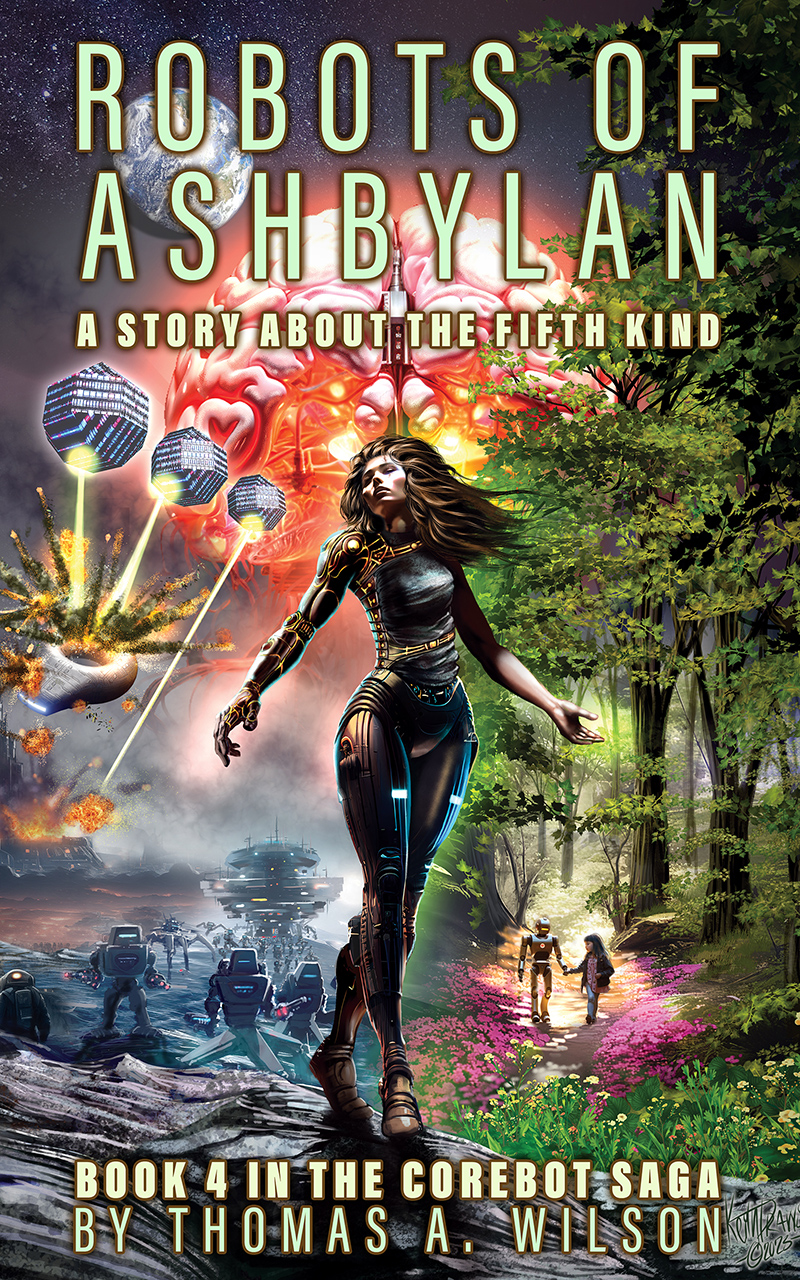
Here is a recent cover I did for “Robots of Ashbylan” by Thomas A. Wilson.
Its a wonderful look at the potential of the current world and the mistakes we may make with AI.
At it’s core it’s a story about rebirth and how often the paths we take are not always chosen by us, but how we can take hope from the fact that with the right help and support we can move onto a better path.
I really enjoyed working on this and I finally got the opportunity to adapt a study I did in watercolour way back in 1988 (it was a scene from a path I would walk down every day in Heaton park when I walked my dog).
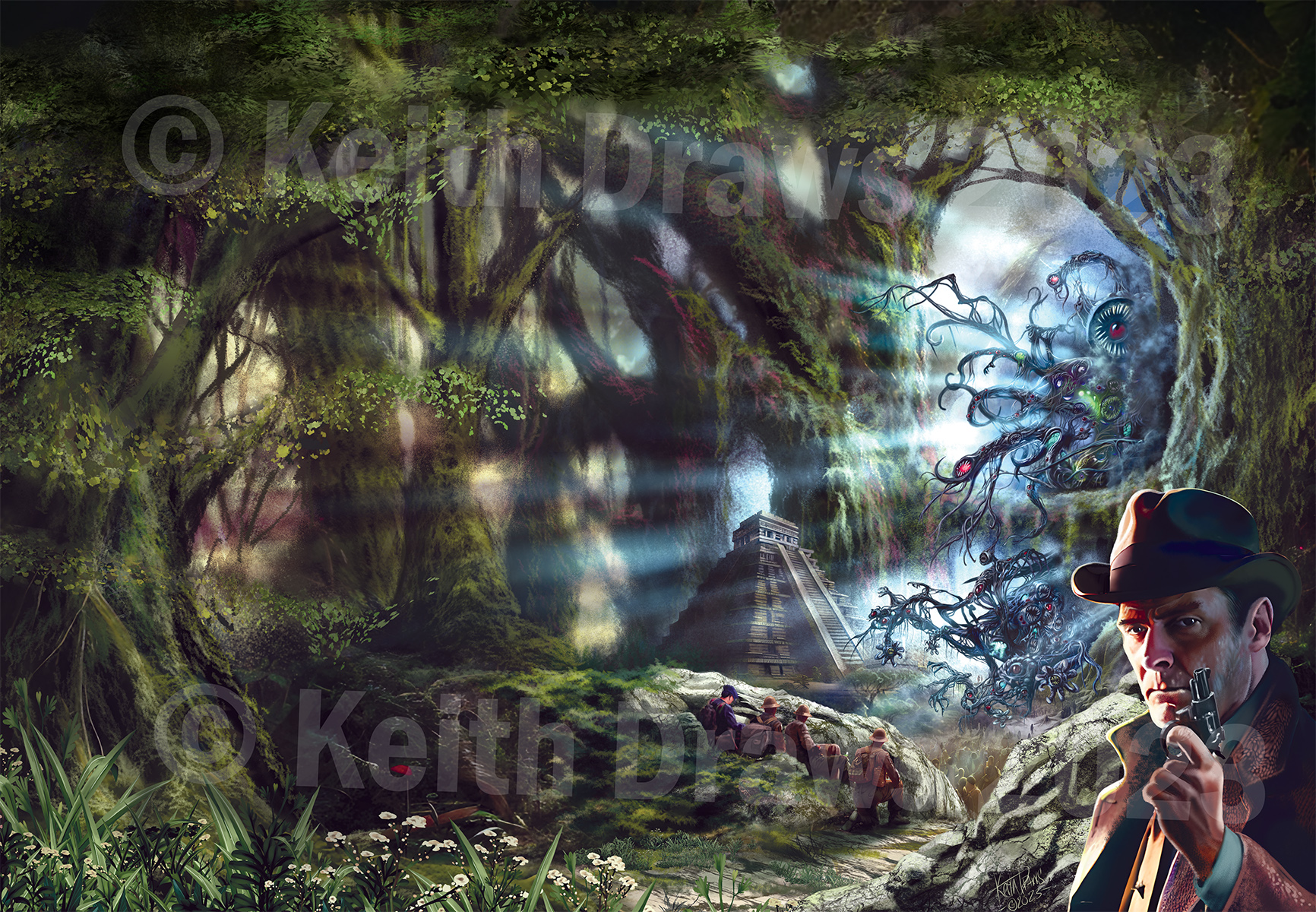
This was me trying to work out how we depict the monsters of the Cosmic Horror genre? What images have you seen and who were those talented artists that created them? Let me know.
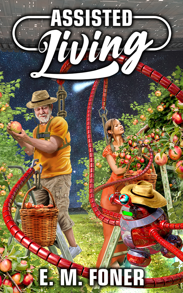
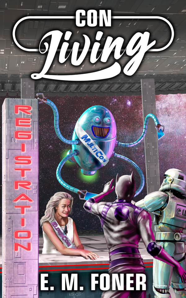
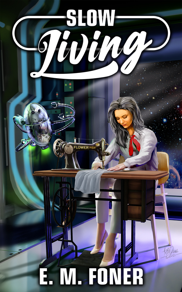
Just realised I’ve never published these covers I did for the excellent E.M. Foner’s Living series. It’s a gently comedy sci-fi series that studies the relationships between humans and aliens living under the shadow of vast a.i systems. Finished The cover for “Double living” just this week. Check out all his books here: https://www.amazon.com./E-M-Foner/e/B00JQLOP8M/ref=aufs_dp_fta_dsk
Of course I’m also feeling the influences of Chris Foss, Chris Archilleos, Peter Elson, Roger Dean, Rodney Mathews and even the great Frank Frazetta, but hopefully I ended up with something that is essentially “me”
Savannah Cordova is responsible for Content Marketing at Reedsy where she is focused on helping Authors. She has contributed posts about writing and publishing to Writers Helping Writers, DIY MFA, IndieReader, and many more sites in the industry.
Congrats! You’ve finished your book, polished the writing, and you’re ready to get it into the hands of your adoring readers.
There’s just one last obstacle standing in your way — creating the perfect cover to, quite literally, bind it all together.
In the self-publishing world, you’ll often hear how important it is to hire a professional editor. Today, however, I’m here to convince you that hiring a professional cover designer is just as crucial to your book’s success, if not more so! Without further ado, here are three reasons why you shouldn’t tackle your cover on your own.
1. People will judge your book by its cover
The cliché advice to not judge a book by its cover is rarely followed by readers. And to be honest, can you blame them? If a book’s cover looks sloppy and rushed, it’s human nature to assume the same about the contents within. Luckily, the reverse is also true: a clean, professional book cover will draw people in and give them an instantly positive impression of your writing.
So how do you come up with just the right cover for readers to judge? Though you, the author, know your book best, you should ultimately leave the execution to your designer. By all means, work collaboratively and give them some ideas for your final cover — if your talents stretch to art and photography, you could even provide some possible images for them to include — but it’s best to let a professional handle most of the details.
Remember that your cover should signal the genre of your book and offer some additional hints as to what it’s about, through everything from beautiful artwork to catchy taglines. Of course, as an author, you’ll likely be familiar with the general look of covers in your genre, but it’s the job of a professional cover artist to incorporate specific trends that will actually sell your book. They’ll know how to include the essential elements of your story on the cover without making it look too crowded, striking the perfect balance of genre-indicative and attractive.
2. Ebook covers need to stand out even more
With platforms like Amazon KDP, it’s easier than ever nowadays to write and publish an ebook. But as exciting as this is for self-publishing authors, it also means that competition is on the rise, with estimates stating that up to one million books are being self-published in the US each year.
As a result, you’ll need a cover that really stands out, even to people scrolling through pages upon pages of options. This cover doesn’t necessarily have to be brightly colored or experimental, but some eye-catching elements are vital to catching readers’ attention — especially if you’re writing in an extra-saturated genre like romance or thriller.
In terms of ebook cover effectiveness, you should also keep in mind that thumbnail images shown online are much smaller than the covers you’d see when browsing your local bookstore. This means your cover needs to work not just as a full-size image, but also in thumbnail form! Even if they can’t tell exactly what’s on the cover, people should be able to read the title and register the aesthetic at a glance.
A professional cover designer will understand how to do all this while sticking to the trends within your genre, and will be well-versed in the rules and guidelines of all the various self-publishing platforms to ensure you have no trouble when uploading.
3. Your cover is your number-one marketing tool
A strong cover will also do wonders for your marketing campaigns — it doesn’t matter how great the copy in your listing is if the book itself looks unappealing. You want something that will halt even the most dedicated Instagrammer scrolling through their neverending feed and intrigue them enough to find out more.
A professional cover designer is your best bet for achieving this. After all, you wouldn’t expect a director to design billboards and posters to advertise their movies; why should this be any different for authors? From nailing the color and composition of your cover to designing suitable ads for the social platforms of your choice (this will cost extra, but it’s worth it), a designer can make your marketing journey go much more smoothly.
With all that in mind, hiring a cover designer ought to be a no-brainer when it comes to publishing your book. Whatever you decide to do, hopefully this post has given you a bit more insight re: just how much work goes into a strong cover — and even if you don’t hire a designer, remember to get friends’ feedback (and encouragement!) so at least you won’t be going it alone.
… and so when putting together some pre-made covers I mentioned I’d done something to Ben of New Comet Games. He really liked it and decided to use it for the back cover of this book “Corsairs of Cthulhu” which you can pre order on that page.
Stormy seas are something I’d like to visit again soon. That was a lot of fun.
Corsairs of Cthulhu back cover art
As usual the work of Frank Frazetta and Todd Lockwood, as well as Alan Lee, Brian Froud, Rodney Mathews, and Peter A. Jones filled my mind and I hope I channelled it into something that was more me than anything else.
Please like and share on social media.. Every little helps 😉
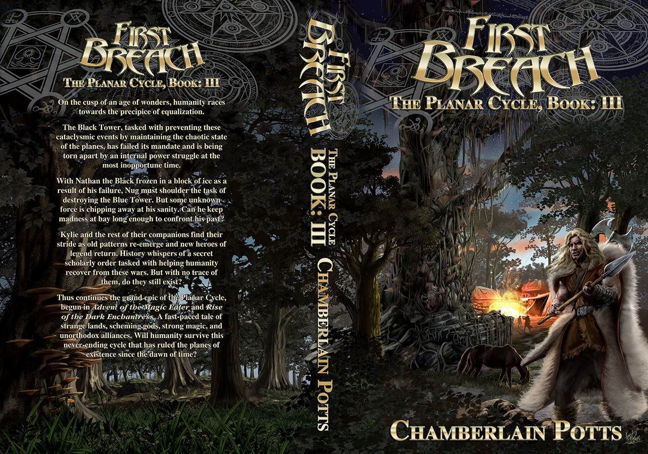
This is the third in a series of covers I was asked to produce for “The Planar Cycle” series by Chamberlain Potts. An incredible fantasy that gave me lots of amazing imagery to work with. Here I depicted “The Bleeding Elm“. A thirty-foot gnarly leafless tree with an abnormally thick truck. They’re covered in thick thorns and have vines that run along the ground to capture and impale anything that ventures too close onto the trunk. Along with the Cymarion in the foreground. I always do my best to ensure all my customers get the maximum value and impact and I also really enjoy doing this.
Lots of fun with this one. Dark forests are always a challenge. Once again the inspiration of Frank Frazetta and Todd Lockwood, as well as Alan Lee, Brian Froud, Rodney Mathews, and Peter A. Jones, play a big part, but hopefully I’m mostly channeling me!
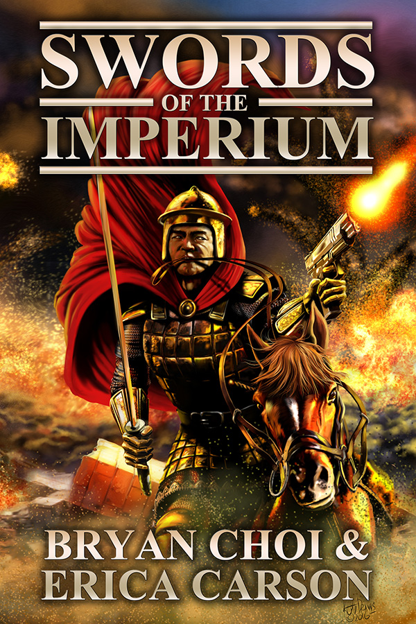
This is the second cover for the new series of science fantasy/dark fantasy books by Brian Choi and Erica Carson. If you want to buy the book or want to know more about the Authors :
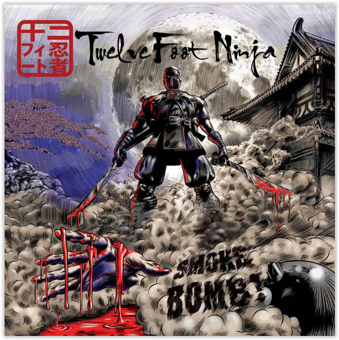
Today “Twelve Foot Ninja” Release their New album “Outlier”
And I produced the cover art. Credit where credit is due though, TFN always have very strong ideas and without their direction this cover would not have worked half as well.
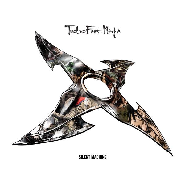
And this is their new single which I also did the cover for:
I’ve been working with TFN since 2010 and in fact they were probably the main reason I was able to move my focus to illustration.
Initially they asked for artists to send a couple of comic panels as samples since they were intending to produce a comic and or graphic novel. I don’t normally do this, but for some reason I had a good feeling about this work and so I produced the following.
TFN sample P1
Two incredible things happened. First the amazing Liam Sharp (currently the lead artist on Wonder Woman for DC) and blew my mind with this comment on my deviant page and I have to say that is probably one of the most inspirational moments of my life. A moment when it felt like all the effort was worth it after what seemed like an eternity of losing battles. I’m happy to say that we also became friends (even if it is only on social media). If Liam had not left that message I suspect I would have gone down another path.
Me feeling awestruck. Liam Sharp
It only gets better… After I’d given up on hearing back about the samples, Stevic from TFN got in touch with me and told me I’d got the Job.
From that point on I worked with the band mainly through Stevic and Dave MacGregor (their manager who they work very closely with). things went well. I worked on a lot of concept with them, finally deciding on the look of the Twelve Foot Ninja and we produced the cover for their second CD
Now we moved on to the next major project. The album “Silent Machine”
Silent Machine Cover
It had 12 tracks and each would have it’s own 6 page comic making up a graphic novella to go with the album.
I produced all the art and wrote the adaptation from the original plot/novel. But I had to tie the stories in with the songs. They pretty much gave me a free hand so long as I stuck to the plot; and the songs are very inspiring which made it a lot easier. It was a hell of a job, on a tight deadline, but we did it!….And I’m very proud of this work. Here are some pages.
I’ve worked on lots of other projects with them over the years and they have done a lot to help me out through some difficult times. They are great people and I doubt I’d even be doing this if it wasn’t for them.
Oh and I’m also working on another new project with them right now so watch this space, it’s going to be awesome!
Twelve Foot Ninja
Outlier
All art produced for “Twelve Foot Ninja” is copyright “Twelve Foot Ninja” and is reproduced with permission.
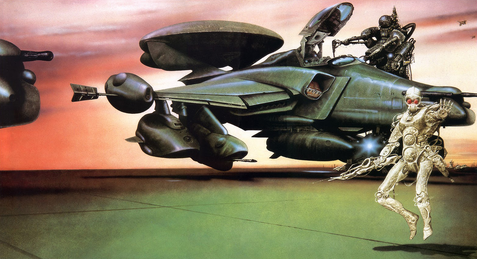
Okay so it’s only on social media but hell! This is a man who has been a great influence on my work for as long as I can remember being interested in Science fiction and he actually takes the time to talk with me. I think the first time I saw his work (at least attributed) was in Omni (a Science fiction and fact magazine) in the late 70’s.
Jim Burns “Mechanismo”
The thing that stuck me about the way he worked was was his ability to contrast very human Star-ships, machinery and people with incredibly “alien” Alien star-ships, machines and characters. The alien part of his work can be almost jarring in it’s difference, and yet at the same time it looks very natural in the scene.
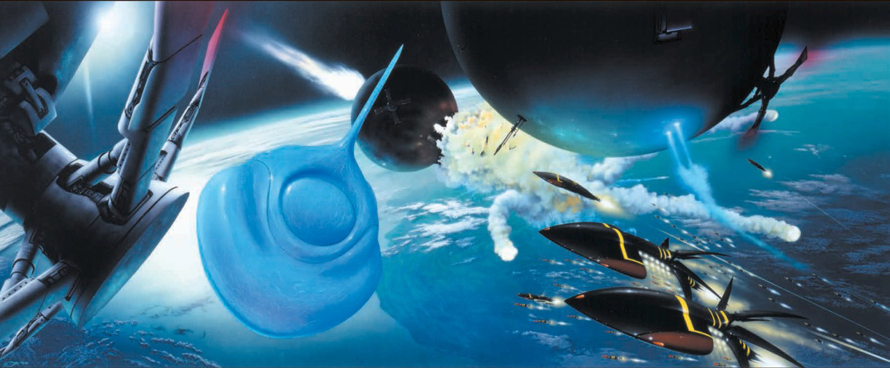
Jim_Burns for “The Reality Dysfunction (Night’s Dawn #1)” by Peter F. Hamilton
Jim is one of the most approachable, pleasant people I’ve ever had the pleasure to talk to and I still feel awestruck every time we talk.
Jim Burns
Keith Draws (awestruck!)
The realism of his work and the incredible detail he applies meticulously have always been something I strive to achieve, with varying degree’s of success, but I have to say the most important thing he does is to take the viewer away from the current reality, into the reality of his science fiction. And something about the way he does this seems to connect to the almost primeval parts of the mind. The effect of looking at his work is almost like experiencing recovered memories, filled with the almost overpowering emotions of awe, excitement, and discovery. The truth is when I look at his art I almost become that “starry-eyed teen” again. Speaking of being a “starry-eyed teen” I remember the first time I saw the cover for Stanislaw Lem’s “The Cyberiad: Fables for the Cybernetic Age” painted by Jim. The image is so alien and yet at the same time so fascinating that it has stuck with me. I don’t think I’ve ever seen an image that had such a profound effect on my outlook before or since.
Jim Burns Art for Stanislaw Lem’s “The Cyberiad: Fables for the Cybernetic Age”
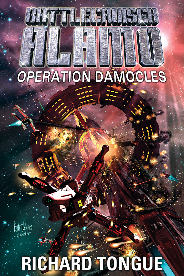
Since I was first introduced to Jim’s Art I wondered what it would be like to have the opportunity to work on such images. In 2012 that opportunity came about when Richard Tongue ordered three book covers from me.
He sent me the books, I read them and really enjoyed them. I remember I put together the roughs for Richard and we just couldn’t finish them fast enough. I knew then that something major was happening in my journey.
Since then Richard and I have worked together on multiple covers (more than 25 if I remember correctly) and Richard recently told me, ” You’ve done some wonderful covers for me over the years, and I always look forward to each one. Often they are some of my biggest inspirations when it comes to writing the book; it’s always great to have that in front of me, urging me on.”when he ordered this:
It is extraordinary to hear such words directed at me when I could say exactly the same thing about Richard’s and Jim’s work. Also, It would be remiss not to say that thanks to the work I’ve done for Richard I’ve also been commissioned to work on many other projects in a similar vein.
Another major influence on my outlook was the magazine OMNI and they just ran a fantastic interview with Jim that I heartily recommend you go read. It’s right here: https://omni.media/jim-burns-interview
I think all that is left to say is a big thank you to Jim for being such an inspiration to me and thank you to Richard for allowing me to put that inspiration into action
As ever he is humble, and wouldn’t we all love to hear that speech. I’ve asked him if it’s around and I’ll let you know what he says.
Bellow in the comments is Richards Response and I have to say I am humbled.
I think I’m going to try and do more posts like this about creators and their influence and if possible I’ll try and get some interviews.