• About
  • Pricing and Payment.
  • Gallery
    • Keith Draws Illustration
    • Illustrated covers
    • Children’s illustration
    • Maps and Cartography
    • Pre Designed Science Fiction, Fantasy and Horror Covers with Free typography.
    • Interior Illustration, Graphics and Concept Work
    • Photo Manipulation and Typographic covers
  • Tips to create your own cover
  • Contact
    • Join the Mailing list for 10% off
    • Contact Details
  • Editing Services
  • Terms and Conditions

keithdraws

~ Effective Cover Design and Creation Made Easy

keithdraws

Tag Archives: Cover Art

Composition: Using the Golden Ratio on your Cover

02 Sunday Sep 2012

Posted by keithdraws in Book Cover Design, golden ratio, Typography

≈ 4 Comments

Tags

book cover, cd cover, composition, Cover Art, design, golden ratio, illustration, kindle, layout, typography

There is a lot of mystical talk about the Golden Ratio:

The Golden Ratio is also known as the Golden Mean, Phi, or Divine Proportion, this law was made famous by Leonardo Fibonacci around 1200 A.D. He noticed that there was an absolute ratio that appears often throughout nature, a sort of design that is universally efficient in living things and pleasing to the human eye. Hence, the “divine proportion” nickname.

source: digital-photography-school.com

But we are not really concerned with all the mysticism and math here: We are simply concerned with how to make a good cover design. So how does it concern us? Well if you divide the imagery up on your cover using this method you end up with a very pleasing and well balanced image.

The Grid looks like this:

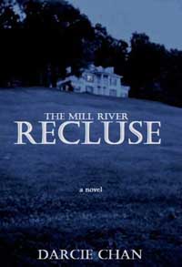
And If you want some evidence of just how well it works:
The cover for “The Help” by Kathryn Stockett looks like it was designed using this principle and according to USA today it was the number one selling book of 2011. Of course, that may have a little to do with the writing as well, but that cover really did grab the attention of potential readers.

A golden rectangle can be drawn out using a straightedge and a compass like this (see below):

  1. Draw a square
  2. Draw a line from the midpoint of one side of the square to an opposite corner
  3. Use that line as the radius to draw an arc that defines the height of the rectangle
  4. now you can draw the golden rectangle with the correct proportions.

You can use the grid anyway round you like, horizontally, vertically, flipped and even in multiples at angles as it is seen in the sunflower. Of course, I recommend keeping things simple, it’s less risky.

The next thing to consider is the proportions of your cover. A paperback book cover, though close, is not quite of the same proportions as the Golden Rectangle. But this doesn’t mean you can’t use it. In the diagram below the green area represents a standard Kindle book cover, and I’ve shown two possible alternative uses of the format. One is scaled down proportionally (as on the cover of “The Help”) and another is scaled vertically in order to use all the books space, this I will call a “Butchered” Golden Rectangle. It still leads to good quality composition, but it’s not quite as aesthetically pleasing.

The same thing applies to CD covers, though the square format is very different making things slightly more problematic as can be seen in the diagrams below.

If you are wondering why this particular compositional model is so appealing, well there are many theories, but nothing is confirmed. Personally, I think its got a lot to do with the subconscious human skill of detecting patterns, and the more perfect the pattern the more we like it.

That said, imperfect patterns such as a “Butchered” Golden Ratio still appeal because they do have internal consistency and a detectable pattern.

Here you can see how I’ve used the Golden Ratio on a recent book cover. I kept it in proportion matching the width of the book but allowing it to bleed just a little above and below the page. Look at the key elements of the cover. The typography; and how the focus is drawn into the word “Rebirth” The way the eye is bisected between the first square and second golden rectangle, the way the beard, nose, and brow follow the curve of the spiral. The way the front edge of the base of the ear bisects the central square, and so on. I’m sure you can spot much more.

Its also possible to use the Golden ratio in your Typography (i.e. with your fonts and text layout) not only on the cover but actually in your book and there is a great blog piece by Chris Pearson about just that right here:  http://www.pearsonified.com/2011/12/golden-ratio-typography.php

I’m going to continue to explore all the other compositional grids, methods and techniques in future posts and with a bit of luck by the end of it all we will all be better cover designers.

If you enjoyed this article and perhaps found some help in here I’d appreciate a Facebook “share” and or “like” and one in as many other social networks as you can bring yourself to click on.

And finally back to the mysticism.

Share this from Keith Draws:

  • Share on Facebook (Opens in new window) Facebook
  • Share on X (Opens in new window) X
  • Share on Pinterest (Opens in new window) Pinterest
  • Share on LinkedIn (Opens in new window) LinkedIn
  • Share on Reddit (Opens in new window) Reddit
  • Share on Tumblr (Opens in new window) Tumblr
Like Loading...

What to think about when designing your cover.

01 Saturday Sep 2012

Posted by keithdraws in Book Cover Design, Composition

≈ Leave a comment

Tags

book cover, Cover Art, design

Everything I’m saying here refers to covers for Books CD’s, DVD’s and anything else you can think of, So I’m just going to refer to your product as a “Book” though the advice will apply to any product.

You can’t judge a book by it’s cover.

Well so the old saying goes, but in fact unless you are well known, then that’s exactly what is going to happen. The cover is the first thing a person will see when looking at your book. In fact it is the first contact you will have with your potential audience and so you really want to capture their interest. This is a time when first impressions really do count, in fact it could be life or death for your work.

So what makes a good cover?

This may sound strange but basically when combined with the title it has to be a “lead in” with a “cliffhanger ending”. Or to put it another way, it has to basically indicate whats inside in a way that leaves the viewer longing to know and experience more.

Here are a couple of examples:

The number one bestselling e-book in 2011 is this self-published e-book
Rushed to print after the brilliant Jobs’ untimely death in mid-October, the book includes interviews with the man and his loved ones.

Looking at the cover of “The Mill River Recluse” makes you start to wonder who he or she is, do they live in that strange isolated house, where is it?. and so on. It’s working.

As for “Steve Jobs” it may not look as if its following that formula but in fact, it is a very well chosen photo of the man. He looks friendly, smart, interesting  and approachable leading the viewer to think that opening this book will let them into the life of a truly fascinating man.

So both those covers leave the viewer wanting more, and that’s what we all want to achieve isn’t it?

In future posts I’m going to explore how to go about achieving this in much more detail; but for now why not take a look at some covers around you and try and determine how well they are doing this.

Share this from Keith Draws:

  • Share on Facebook (Opens in new window) Facebook
  • Share on X (Opens in new window) X
  • Share on Pinterest (Opens in new window) Pinterest
  • Share on LinkedIn (Opens in new window) LinkedIn
  • Share on Reddit (Opens in new window) Reddit
  • Share on Tumblr (Opens in new window) Tumblr
Like Loading...
Newer posts →
 mailing list button
Follow keithdraws on WordPress.com

About this Blog

We post lots of great advice on how to create your own book covers. Just check the Categories bellow.
We also offer custom made covers, illustrated, photomontage or purely typographic, if you don’t want to do the work yourself.
Any questions feel free to contact us, just click the contact tab above.
If you want to support me in my illustration work go here

Categories

  • blogging for sales.
  • Book cover
  • Book Cover Design
  • Cards
  • color
  • Comic Art
  • Composition
  • E book sizes
  • Editing
  • Fantasy
  • Fantasy art
  • Fantasy ready made cover
  • General
  • golden ratio
  • High Fantasy
  • Historical fiction
  • Humor
  • Illustration.
  • Interview
  • Interviews
  • Panther
  • Photo compositing
  • Photo compositing
  • Photoshop
  • publishing
  • Science Fiction
  • The Rule of Thirds
  • Typograpghy
  • Typography
  • Typography
  • Uncategorized

Archives

  • November 2023
  • September 2023
  • June 2023
  • November 2022
  • January 2022
  • November 2021
  • August 2021
  • July 2021
  • June 2021
  • July 2020
  • March 2020
  • October 2019
  • May 2019
  • April 2019
  • December 2018
  • June 2018
  • April 2018
  • March 2018
  • November 2017
  • September 2017
  • July 2017
  • June 2017
  • September 2016
  • August 2016
  • June 2016
  • May 2016
  • January 2016
  • December 2015
  • June 2015
  • May 2015
  • April 2015
  • January 2015
  • November 2014
  • October 2014
  • September 2014
  • August 2014
  • April 2014
  • March 2014
  • February 2014
  • January 2014
  • December 2013
  • November 2013
  • July 2013
  • April 2013
  • October 2012
  • September 2012
  • August 2012

Keith Draws Cover Art on Facebook.

Keith Draws Cover Art on Facebook.

Keith Draws on Twitter.

Tweets by Keith_Draws

Recent Posts

  • The Dangers of AI.
  • Check out The Tower’s Alchemist Film Script by ALESHA ESCOBAR
  • Amazon Shadow Categories.
  • How to Paint Cosmic Horror?
  • E. M. Foner, Living Series Cover art

Meta

  • Create account
  • Log in
  • Entries feed
  • Comments feed
  • WordPress.com

Blog at WordPress.com.

  • Subscribe Subscribed
    • keithdraws
    • Join 79 other subscribers
    • Already have a WordPress.com account? Log in now.
    • keithdraws
    • Subscribe Subscribed
    • Sign up
    • Log in
    • Report this content
    • View site in Reader
    • Manage subscriptions
    • Collapse this bar
 

Loading Comments...
 

    %d